NOTAS Taller de programación
Desarrollo de GUI en SWING
¿Que es Swing? Es una tecnología java para la construcción de GUIs de escritorio. Biblioteca que contiene un conjunto de controles y elementos gráficos que permiten interactuar con la capa lógica:
- javax.swing
- javax.swing.events
Las principales características son:
- Componentes:: Qué forma parte de la GUI
- LayourManagers:: Como se organizan los componentes
- Modelos:: como se muestra la información
- Eventos:: Como se realizan acciones
Componentes
Para visualizar un control swing en pantalla, este debe pertenecer a alguna jerarquía de contenedores (cuya raíz será un top-level container). Los componentes se encuentran organizados en una jerarquía de 3 niveles:
Top-level containers: Son la raíz de la jerarquía. Ejemplos de estos son el JFrame (ventana con título y borde) y el JDialog (sub-ventana independiente ej cuadro de dialogo). Cada top-level container tiene un content-pane que contenderá todos los componentes visibles. Los top level pueden incluir una menu bar, esta no forma parte del content pane.
intermediate containers: pueden tener otros contenedores intermedios y/o contenedores básicos. Ejemplos de estos son:
- Jpanel: contenedor de componentes
- JScrollPane: Proporciona barras de desplazamiento alrededor de un componente
- JSplitPane: Permite al usuario cambiar el tamaño relativo de dos componentes (es como tener una barra en el medio que puedo mover de un lado para otro)
- JInternalFrame: Ventana dentro de una ventana.
basic components: controles elementales de I/O para display y operación del usuario. Ejemplos:
- JLabel: etiqueta de texto
- JTextField: Campo de ingreso de texto
- JComboBox: Muestra una lista de opciones como un combo desplegable
- JButtonL: Botón que permite asociar una acción al evento de pulsado del botón.
Layouts
Los layouts son el esquema de distribución de los elementos dentro de un diseño. El layout manager es un objeto que implementa la interfaz LayoutManager y determina el tamaño y posición de los componentes en un contenedor. Es decir, realiza el layout automáticamente de los elementos que se agregan al contenedor y el layout manager controlará. Existen multiples layout managers o puede no utilizarse ninguno (llamado Absolute Layout). Los layout más comunes son:
- BorderLayout
- FlowLayout
- BoxLayout
- GridLayout
Modelos
Casi todos los componentes poseen un modelo. Sin embargo, el programador no tiene por qué conocerlos. Los más útiles son colecciones de elementos que serán mostrados por componentes. Por ejemplo, si tenemos una lista de elementos y queremos mostrarlos en un JList, debemos trabajar sobre el modelo de la lista para que se vea decente en la pantalla. Otro ejemplo es para manipular info en un JTable.
Eventos
Los eventos ocurren cuando el usuario interactúa con la Gui. Todo componente puede tener una serie de eventos que se disparan y se les puede especificar el código que se ejecutará cuando esto ocurra. Es similar al manejo de excepciones, lleva al event-driven programming
Gestión de cambios de software \ Software change management (SCM)
La idea es mantener un correcto versionado del sistema. Es esencial no perder archivos. Previenen el caso de sobrescribir código y la perdida de trabajo por falta de respaldo (Si se mantiene un respaldo).
Las herramientas SCM permiten que múltiples desarrolladores modifiquen el mismo código. Automatizar las actualizaciones entre versiones. La capacidad de acceder a versiones previas de nuestro código.
Conceptos principales
- Version principal (MASTER) y ramas (branches)
- Versiones simbólicas (tags)
- Gestionado, check out, commit, diff, merge (modificaciones)
- Gestionado: Poner un archivo bajo configuración en la herramienta
- check out: obtener versión del sw (branch,tag,archivo,etc.)
- Commit: confirmar cambios en el software. Si tiene éxito genera una nueva version, si hay conflictos hay que analizar los cambios y hacer un merge
- Diff: Me deja ver los cambios entre versiones de un archivo
Hay dos ideologías en herramientas de gestionado de software:
- Repositorios centralizados (SVN)
- Repositorios distribuidos (GIT)
Los conceptos vistos aplican a todas.
SVN
En el svn hay un solo servidor con todas las versiones. Todos saben en cada momento que está haciendo cada uno. Único punto de falla.
GIT
Que es GIT?
Git es un software de gestión de cambios. Controla los cambios sobre archivos y mantiene un versionado del sistema. Nace a eso de 2005 cuando BASED LINUX TORVALDS no se dejó ser estafado por BitKeeper y desarrolló git. Ahora todos usan git. Lmao bottom text.
Distribuido (Entre comillas). Varias copias en cada usuario. Cada clone del repositorio es un backup de todos los datos, no hay un solo punto de falla. El problema es más difícil saber en qué están trabajando cada uno de los integrantes. Eventualmente hay que mandar las cosas al servidor remoto y eventualmente resolver los conflictos.
Los archivos en git pueden estar en 3 estados, committed, modificados y preparados (staged). Siempre al hacer un commit se crea un snapshot al que se puede acceder.
Ciclo de trabajo
Primero hay que configurar la identidad:
git config --global user.name "LOL LOL"
git config --global user.email "[email protected]"
Luego clonamos un repo con el git clone
Los archivos pueden trackearse o no trackearse. Tener en cuenta que los meta-datos de los IDE no deberían ser trackeados. Si lo hiciera tendría constantemente merge conflicts con los meta-datos de las IDE de otros usuarios.
Realizar las transiciones de estado para los archivos implica la invocación de un comando GIT
Branchs
Es una línea separada de código con su propia historia. Es un puntero a un commit. El branch principal por defecto es MASTER Las funcionalidades se deberían desarrollar en un branch y luego andar incorporándolas a master.
origin/master es el commit más reciente que el servidor remoto recuerda. Es responsabilidad del prog ir actualizando...
git commit -m "Jannies get the rope."
El git checkout -b funcionalidad crea una nueva branch. Cuando empiezo a commit voy a estar committing en la nueva branch.
Luego checkout master hago para pararme en master. Para juntar la nueva branch con master hago git merge funcionalidad.
Tras mergear es buena práctica borrar la branch. Para ello: gir branch -d funcionalidad.
Para resolver un merge conflict debemos ejecutar git mergetool. Git mergetool debe configurarse para ejecutar un programa para resolver el conflicto (que nos asista) por ejemplo: Meld, emerge.
Para enviar cambios al servidor remoto tenemos que hacer git push origin master.
Para crear etiquetas hacemos git tag -a entrega1 -m "Entrega tarea 1"
La etiqueta se crea localmente para que el resto pueda obtenerla hay que compartirla, para ello: git push origin entrega1
git status me dice el estado del repositorio.
gitk es una herramienta que nos permite ver en una GUI el estado de un repositorio, con el DAG de commits. Posibilitando la inspección de forma gráfica de los cambios de cada commit.
JAVA
JAVA es un lenguaje de programación con una sintaxis similar parecida a c++ aquí dejo algunas características adicionales:
Se añade el legendario for each loop:
for(dataType item: array){
    f(item)
}
Tenemos los break/continue statements.
Recordar el concepto de deep/shallow copy. Tenemos funciones para copiar arreglos como arraycopy() y copyOfRange()
Ejemplo de clase:
class Lamp {
    final int marca =  12;
    boolean isOn;
    Lamp(x){
        this.isOn = x;
    }
    public static void main(string[] args){
        ...
    }
    public int turnON(){

    }
}
Notar que las funciones tienen su visibilidad incluida. Static indica que el método es estático y no necesita al objeto para ser llamado.
El constructor lleva el mismo nombre. Notar el uso del this. El atributo final indica que la variable no puede modificarse, en funciones significa que la función no se le puede hacer un override.
Para saber de qué tipo es la instancia de un objeto podemos usar la función booleana instance of:
String name = "LOL"
boolean result1 = name instanceof String
Sirve también para interfaces y herencia.
Para hacer sublcassing utilizamos la notación:
class LED extends Lamp{
    ...
    LED(){
        super(x)
        ...
    }
    public int ledy(){
        super.turnON()
    }
}
Notar el uso de super para referirse a la clase padre. Super también refiere a la invocación del constructor.
Podemos indicar que una clase es abstracta con la keyword abstract
abstract class Lang{
    ...
    //Esta puede tener métodos abstractos y normales
    abstract void f();
    void g(){
        ...
    }
}
Las interfaces tienen su sintaxis exclusiva:
interface Language {
    public void getType();
    public void getVersion();
}
Una realización de esta interfaz es:
class english implements language{
    public void getType(){
        ...
    }
    public void getVersion(){
        ...
    }
}
Lo nuevo de java es la capacidad de tener clases anónimas y anidadas. Esto es bastante extraño y no es claro si es necesario aplicarlo en nuestro problema.
class outter{
    class inner{

    }
}
Hay todo un dilema sobre la necesidad de instanciar primero la clase outer si queremos la clase inner. También está la cuestión de que si inner fuese static entonces se podría instanciar directamente. Agrega un montón de complejidad. Un ejemplo de clase anónima es:
class example{
    obj = new Type(parameterList){
        //cuerpo de la clase anónima
    }
}
La clase enum está presente:
enum Size{
    SMALL,BIG
}
x = Size.SMALL
Java provee utilidades para enums como el .name() y .toString()
Java tiene la capacidad de las reflections, lo que permite al programador inspeccionar y modificar clases y métodos que ya están definidos. Otra cosa que no me es clara para que sirve...
Las excepciones se realizan con un try...catch y pueden tener un finally al final para ejecutar código tanto si la op falla como si no. El throw nos permite tirar excepciones y el throws nos permite definirle a la clase el tipo de excepciones que podría tirar. También tenemos los try con recursos. El cual nos permite administrar recursos de manera más eficiente.
Las anotaciones de java es información para el compilador que nos permite detectar bugs de manera prematura. Por ejemplo @override indica nuestra intención de hacerle override a una función.
Java también tiene la capacidad de utilizar asserts. El cual permite imponer condiciones: assert condition;
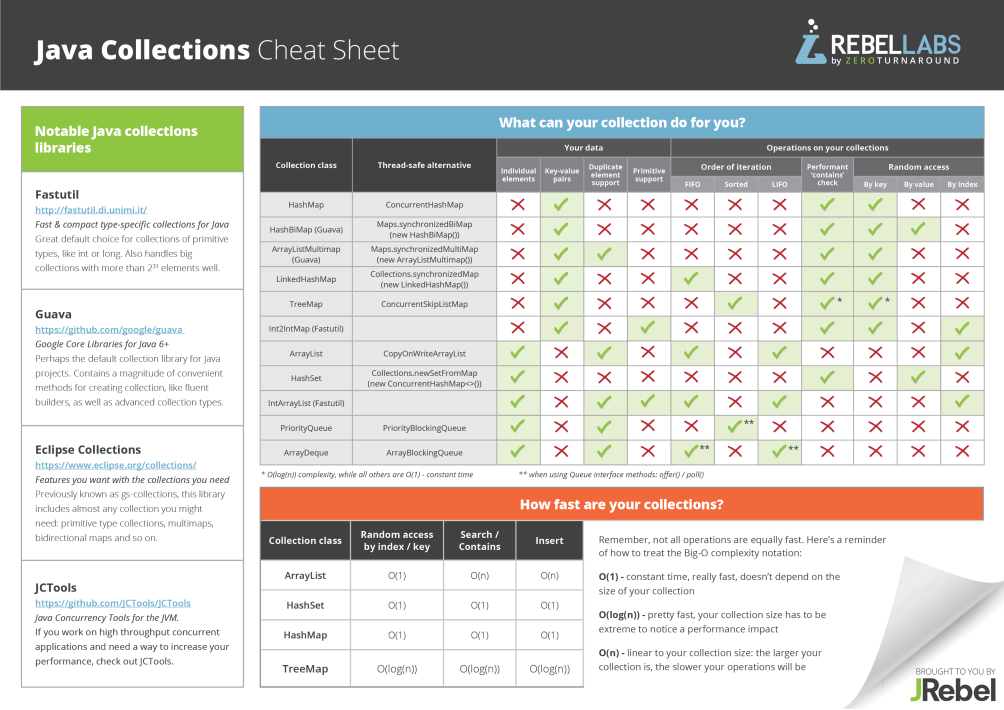
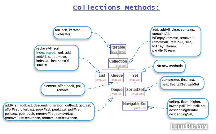
Java incluye el agradable Collections FrameWork el cual tiene todos los data-types que necesitamos. Tenemos List, Set, Queue, Map, Iterator... todos estos son interfaces que nos permiten resolver distintos problemas.
Ejemplo de arraylist:
// create   type arraylist
ArrayList<Integer> arrayList = new ArrayList<>();
Luego puedo ir haciendo arrayList.add(1) e ir agregando elementos.
Diagrama para elegir una colección:
Testing
Error, defecto, falla
Un error humano puede generar un defecto (interno) que puede generar una falla (externo) El software falla cuando no hace lo requerido o hace algo que no debería. Se debe de intentar corregir los defectos lo antes posible.
Prueba
Proceso de ejecutar software con el fin de provocar fallas. Para provocar fallas creamos casos de prueba tomando en consideración:
- Objetivo
- datos de entrada
- condiciones de ejecución
- resultado esperado
Esto crea un conjunto de casos de prueba (artefacto) que permite verificar que el sistema cumple con los requerimientos (empíricamente).
Caja Negra y Blanca
Formas de categorizar una prueba
Una prueba de caja negra implica construir los casos de prueba basándose en "que hace" el sistema. Se generan con la especificación y no se mira el código del software. Permite validar características externas, integración, etc.
Una prueba caja blanca (transparente) se da cuando los casos de prueba se generan a partir de la implementación. Se usa la especificación para obtener el resultado esperado.
Técnicas de caja negra
Técnicas de caja negra:
- Partición de clases de equivalencia
- Valores límite
- Tablas de descripción (reglas complejas)
- Basado en máquinas de estado
- Basado en casos de uso (casos de prueba en alto nivel)
- etc.
Clases de equivalencia
Se parte la entrada en clases de equivalencia. Datos de clase -> mismo comportamiento. Es el método más intuitivo. Por ejemplo: (identificar si una persona es mayor de edad. Dividimos en clases válidas e invalidas. Alfanuméricos, negativos, reales, edad máxima, etc.)
Valores límite: Para determinar las clases de equivalencia se suelen usar los extremos de las mismas. Es normal encontrar defectos en los extremos.
Múltiples entradas independientes: Se tienen varias entradas que no tienen constraints entre sí. Podemos partir cada uno de los dominios en clases de equivalencia. Se arman datos de prueba considerando que solo es necesario cubrir una clase invalidad a la vez y cubrir la mayor cantidad de clases validas.
Múltiples entradas dependientes: En este caso las entradas no son independientes en lo que respecta al tratamiento de datos. Por ejemplo, el input de 3 lados de un triángulo para determinar si es isósceles. Aquí toma importancia la relación entre las entradas y para partir las entradas hay que basarse en el comportamiento trabajando con la especificación.
Técnicas de caja blanca
Técnicas de caja blanca:
- Basadas en flujo de control.
- Sentencias, condición, decisión, condición/decisión, condición simple, etc.
- Basadas en flujo de datos.
- Todos los c-usos, todos los p-usos, todos los caminos definición-uso, etc.
- Basadas en mutantes.
Se basan en el flujo de control del programa y los árboles de decisiones inherentes a los algoritmos.
Cubrimiento de Sentencias
¿Cuántas y cuales sentencias cubrimos al ejecutar el conjunto de casos de prueba? El cubrimiento de sentencias se cumple cuando se ejecutan el 100% de las sentencias, al menos una vez, para ello se tienen que ejecutar un set de casos de prueba. Este cubrimiento es de caja blanca.
Puede haber trayectorias o datos que igual provoquen defectos tras cumplir con el cubrimiento de sentencias. Pero de todas formas ganamos más confianza en nuestro código y nuestros casos.
La prueba (test) demuestra la presencia de faltas y nunca su ausencia (Dijkstra)
Herramientas
JUnit:
- Ejecución de casos de prueba de prueba unitarios
- Permite automatizar las pruebas
- Facilita las pruebas de regresión (cuando uno hace cambios en el software, uno puede inyectar errores. Si hago un cambio con un error, voy a enterarme enseguida si el cambio genera alguna falla.)
EclEmma:
- Información del cubrimiento de sentencias alcanzado.
Sugerencias
- Revisar el código: Aquí se detectan la mayor cantidad de defectos, si se detectan tempranamente mejor.
- Construir y ejecutar (pruebas unitarias). Hacer casos de caja negra. Permite asegurar la funcionalidad del software.
- Ver el cubrimiento alcanzado para continuar cubriendo caos.
- Si a medida que implemento construyo casos entonces el testing no lleva tanto tiempo. Más aun comparándolo con el costo del retrabajo.
Desarrollo Web (+Java EE)
World Wide Web: Sistema de archivos identificables globalmente por un URI (Uniform resource Identifier). Un recurso tiene siempre asociado por lo menos un URI. Los archivos pueden contener URIs de otros archivos, así construyendo la web.
La diferencia entre un URI y una URL (uniform resource locator) es que la primera es un string que identifica un recurso mientras que la siguiente es un subtipo de URI que permite localizar un recurso mediante un protocolo.
Formato simplificado de una URL:
"http://" host[":" port] [abs_path ["?" query]] query: Pares x=y separados con un & Host es el nombre o dirección IP del servidor. Port es el puerto TCP en el que el servidor web escucha. Por lo general es 80... no es necesario especificarlo. Abs_path es la ruta del archivo que se desea obtener. Query permite pasar parámetros extra al servidor (Ej: ?lenguaje=es&país=uy)
Existen 9 métodos para el cliente se comunique con el servidor:
- GET: Pide un recurso (los parámetros se pasan en la url) (Permite enviar poca info)
- POST: Envía información (Los parámetros se pasan en el cuerpo del pedido, permite enviar archivos)
- PUT,DELETE,HEAD,OPTIONS,etc.
El servidor puede responder con varios códigos:
- 200: OK (no errors)
- 404: Page not found
- 500: Internal server Error (Error!)
Una sesión Web es un conjunto de pedidos que un navegador hace a un servidor Web. Como HTTP es stateless, la plataforma debe proveer un mecanismo para guardar la información de la sesión:
- Reescritura de URL (Agregar datos de la sesión a la URL, como desventaja el mecanismo es menos seguro y genera URL largas e incomprensibles)
- Cookies: Conjunto de datos que el servidor envía al navegador para que lo guarde en un archivo. El servidor utiliza el encabezado Set-Cookie para que el navegador guarde un ID de la sesión. El navegador usa el encabezado cookie en sus siguientes pedidos para identificarse (usando la cookie que vino del set-cookie).
Esta sesión es iniciada la primera vez que el usuario accede a la app usando el Browser, es mantenida por la plataforma mientras el usuario usa la aplicación. Esta puede ser invalidada por el servidor.
HTML
HyperText Markup Language. Es un lenguaje para expresar el contenido para una página web, tiene una forma arborescente. Utiliza etiquetas para indicar los diferentes elementos de un documento. Documento HTML = Página web
Los navegadores convierten el código HTML en páginas visuales y audibles (wtf XDDD), es el más popular. La última versión es HTML5.2 lanzada en 2017. (HTML nace en 1991)
Todo HTML está contenido en las etiquetas < html > < /html > seguido por un < head > ... < title > ... < /title > < /head > < body > .... ¡Se sigue una estructura de árbol! ¡Cada uno de estos nombres son las etiquetas que constituyen y definen la estructura de la webpage!!! Es bastante similar a XML. Podemos observar que las marcas vienen en pares, delimitan el contenido, tienen atributos y tienen un efecto recursivo. Principales etiquetas: < hmtl >, < body> , < form>, < a>, < div>
Estructura
<!DOCTYPE html> <!-- instrucción para preproceso -->
<html> <!-- elemento raíz -->
<head> <!-- encabezado -->
Acá van el título, metadatos, enlaces a otros recursos (ej. hojas
de estilo, scripts, etc.), etc. Esto no se muestra en la página.
</head>
<body>
Acá va el contenido, lo que se va a mostrar.
</body>
</html>
Formularios HTML
Permiten el envío de información al servidor. Pueden utilizarse tanto con GET como POST, Es una etiqueta < form> que define donde se manda el pedido. Este está constituido por etiquetas < input> la cual toma diferentes formas según el atributo type:
- text: text input (one-line)
- password: text input con texto oculto
- radio: botón con una opción excluyente
- submit: botón que envía el formulario al action del form
- etc: HTML5 agrega mucho más como: email,date,color,number,etc.
CSS
Cascading Style Sheets, permite definir la presentación de un documento HTML. Este independiza la presentación de la información del documento. Personaliza los colores, fuentes, distribución del texto, etc.
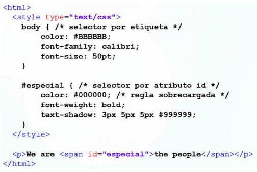
Las reglas CSS tiene especificidad. Pueden ser importantes y se pasan por encima las demás reglas, pueden ser inline y estar embebidas en el HTML, o normales. Y aplicarse según su orden.
DOM
Viene de Document Object Model. Es un modelo que permite representar un documento de forma independiente del lenguaje. Define una interfaz estándar para manipular documentos con estructura arborescente. Para HTML, permite acceder a los elementos, atributos y contenido mediante objetos Node. Existe un nodo raíz que se le llama document.
De esta manera se puede recorrer todo el documento mediante métodos de Node (childNodes,firstChild,nextSibling,etc.). Se puede obtener un elemento con el método getElementById y se pueden crear createElement, agregar (appendChild) y borrar (removeChild) elementos.
JavaScript
Es un lenguaje de programación imperativo, interpretado, dinámico y débilmente tipado. Los navegadores ejecutan código JavaScript que viene de una página Web solicitada. Se puede embeber en la página HTML mediante la etiqueta < script> tanto en el head como en el body. Por lo general el código se incluye en archivos separados (tanto usando camino relativo o una URI): < script src="...">< /script> Un JavaScript puede cambiar la estructura, contenido y estilo de una página Web modificando su DOM:
var unSpan = document.getElementById(“spanID");
unSpan.innerHTML = “Hola JavaScript";
unSpan.style.fontSize='35px‘;
var unBoton = document.createElement(‘input’);
unBoton.setAttribute(‘type’, ‘button’);
document.getElementById(“formID").appendChild(unBoton );
A veces se embebe directamente el script para funcionalidades simples como el manejo de eventos. Por ejemplo: onclick, onload, onunload, onchange, onmouseover, etc.
Recordar que este JavaScript se ejecuta del lado del cliente!!! Toda esa basura de JSP es "dinamismo" del lado del servidor, y se ejecuta dentro de él. Al usuario le devolvemos un HTML y fue.
jQuery
jQuery es una librería de JavaScript, permite simplificar procedimientos habituales simplificando la sintaxis. Se puede extender con plugins. Brinda las siguientes características:
- Manipulación DOM
- Manipulación CSS
- Manejo de eventos
- Efectos y animaciones
- AJAX
Ejemplos de queries son:
$(document) – el documento
$(this) – el element actual
$(“tagName") – todos los elementos < tagName>.
$(".className") – todos los elementos de class=“className".
$("#id") - el elemento con id=“id".
AJAX
Asynchronous JavaScript And XML. Permite que el navegador haga pedidos en segundo plano sin la necesidad de recargar la página cuando se recibe un pedido o se envía uno. Permite el desarrollo de single page applications. Utiliza el objeto XMLHttpRequest que lo implementa los navegadores. Un claro uso de esto son las sugerencias de la barra de búsqueda.
Ejemplo de uso:
• Crear objeto XMLHttPRequest
var xhttp = new XMLHttpRequest();
• Especificar el tipo de pedido (método HTTP, URL del script en el
servidor, asíncrono o síncrono).
xhttp.open("GET", url, true);
• Enviar pedido
xhttp.send();
• Definir la función de callback (se ejecuta cuando llega la
respuesta)
xhttp.onreadystatechange=procesarRespuesta;

function procesarRespuesta(){
    if (xhttp.readyState == XMLHttPRequest.DONE
        && xhttp.status == 200){
        document.getElementById(“spanID").innerHTML = xhttp.responseText;
    }
};
Bootstrap
Es un conjunto de herramientas para facilitar el desarrollo de páginas Web. Incluye, pero no se limita a: CSS, fuentes, templates, extensiones JS, etc. Permite la creación de páginas "responsivas" y esta tiene en mente el uso en dispositivos móviles. Las páginas que no son responsive en computadoras pueden andar bien, pero en celular no tanto... :P
Básicamente se la jugaron y todo el laburo en AJAX y eso lo packagearon en componentes de forma que los demás desarrolladores no tengan que reinventar la rueda.
Les recomiendo que no se maten tanto si les complica mucho usarlo xd
Aplicaciones Web
Son aquellas que residen en un servidor Web y son accesibles a través de la red usando un browser. Consta de recursos Web estáticos (paginas, fotos), y de componentes ejecutables. Los webservers ejecutan estos componentes y generan contenido dinámico para el cliente. Algunos componentes se los puede enviar al cliente para que el los ejecute (JavaScript). Son hospedados en un webserver capaz de ejecutar estos componentes y enviar los recursos generados a los navegadores, aunque el cliente también puede ejecutar los recursos.
Las ventajas de las aplicaciones web son su fácil distribución (literalmente escribir la url en el navegador), actualización automática (no existe el concepto de versiones viejas), permite buen escalado ante muchos usuarios y estos solamente necesitan un navegador web para poder acceder.
Server Side Scripting
Método de desarrollo Web en donde le código (script o programa) se ejecuta en el servidor para generar páginas web dinámicas. Los servidores web pueden directamente ejecutar el código o utilizar intérpretes, módulos y ambientes externos para ejecutarlo.
Algunos ejemplos de tecnologías son: Servlets/JSP/JSF (Java EE), ASP.NET, PHP, Ruby on Rails, JavaScript (Node.js), Python, Perl, etc. En java vamos a usar servlets y paginas JSP.
Java EE
Java platform enterprise edition. Es una plataforma Java que facilita el desarrollo de aplicaciones Web, WebServices, sistemas distribuidos y arquitecturas en varios niveles. Los paquetes a utilizar son (algunos):
- javax.xml.ws (cliente de web services)
- javax.persistence (api de persistencia)
- javax.servlet (soporte para servlets)
- javax.servlet.jsp (java server pages)
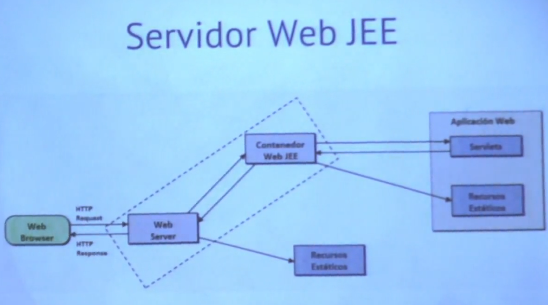
Su arquitectura es de 4 capas: capa de cliente, capa Web, capa de negocio y capa de sistema de información empresarial (EIS)
La arquitectura de ejecución de Java EE se basa en el concepto de contenedores (container). Un contenedor es un ambiente de ejecución (runtime) que se encarga de
- Manejar el ciclo de vida del componente
- Brindar Servicios (transacciones, persistencia, inyección de dependencias, seguridad, mensajería, validación, etc.)
Un servlet (web component) corre en un Web Container.
Un servidor de aplicaciones Java EE es un software que implementa algunos o todos los tipos de contenedores Java EE. Apache Tomcat es un servidor de aplicaciones que implementa JEE parcialmente.
Java server pages ayuda a armar el HTML de manera más amigable que un servlets. Un servlets no es más que un objeto que permite manejar una petición a una página web y devolver una respuesta ejecutando su código java. Mientras que JSP es HTML con código java embebido (útil para HTML dinámico)
Por cada URL que se define necesito un servlet que atienda dicha solicitud. Para marcar el código Java embebido se los rodea con un <% ... %>.
El servlet actúa como capa intermedia entre el cliente web y las bases de datos/lógica/aplicaciones del servidor (muh servidor central).
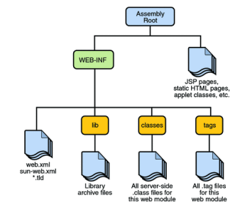
Deployment
Las aplicaciones JEE se empaquetan en una o más unidades de deployment que se copian en el servidor de aplicaciones. Las unidades de deployment se llaman módulos donde módulo corresponde a un tipo de contenedor (ej. un módulo Web corresponde a un contenedor Web, un módulo EJB corresponde a un contenedor EJB).
Cada módulo empaqueta uno o más componentes del mismo tipo de contenedor y un descriptor de deployment (opcional). Los modulos web se empaquetan en archivos war con la siguiente estructura:
Java API (javax.servlet.http.HttpServlet)
Clase abstracta que define métodos que se llaman en distintas situaciones. Redefine algunos métodos para que el servlet funcione (ej. Método GET y POST (HttpServlet.doGet(HttpServletRequest req, HttpServletResponse response)))
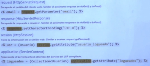
El request y response encapsulan las peticiones y respuestas entre el cliente y el servidor. El ServletRequest tiene como métodos getParameter() que retorna el valor del parametro y getParametersNames() que retorna los nombres de los parametros. Por otro lado, ServletResponse encapsula la respuesta. Se puede devolver los datos con getWriter() modo texto o en binario: getOutputStream()
JAVA EE define dos clases para guardar información persistente a un Request/Response (HttpSession y ServletContext). HttpSession encapsula la sesión del cliente web con el servidor. Es compartida por todos los pedidos de un mismo cliente. (Se obtiene con el getSession de un request) y permite guardar información del estado de la sesión: setAttribute() y getAttribute() ServletContext encapsula el contexto de la aplicación web. Es análogo al session pero a nivel de la aplicación. Este se obtiene con el getServletContext()
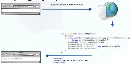
Ejemplo de Java servlet:
@WebServlet(description = "Servlet da la hora", urlPatterns = { "/acaestamiservlet" })
public class MiServlet extends HttpServlet {
    public MiServlet() {}
    protected void doGet(HttpServletRequest request, HttpServletResponse response) throws
    ServletException, IOException {
        PrintWriter writer = response.getWriter();
        writer.println("<html>");
        writer. println("<h1>Hello world!</h1>")
        writer.append("<p>Context Path: " + request.getContextPath()+"</p>");
        writer.println("<p>La hora es: " + new Date().toString()+"</p>");
        writer.println("</html>");
    }
}
JSP
Como es muy duro hacer Html a manopla nace el JavaServer Pages. Extiende los servlets y permite aplicar server side scripting a un documento HTML, siendo más apropiado para contenido dinámico. Apunta a separar la lógica de la generación de contenido con la presentación de los datos generados. La lógica asociada a la presentación del contenido dinámico se incluye embebida dentro del contenido estático. Es como que JSP es el encargado de visualizar el contenido.
Las partes dinámicas se marcan con tags JSP. Son trozos de código Java llamados scriptlets.
Ejemplo:
<%@ page language="java" contentType="text/html; charset=UTF-8"
pageEncoding="UTF-8"%>
<%@ page import='java.util.Date' %>
<html>
<head>
<title>Hola Mundo</title>
</head>
<body>
<h1>Hello world</h1>
<p>La hora es: <%= new Date() %></p>
</body>
</html>
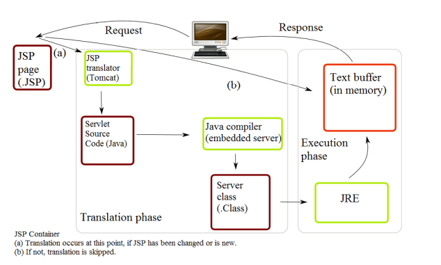
Tomcat va a dirigir a un archivo .jsp (fuente), este se va a compilar y va a generar un servlet compilado que tomcat va a utilizar para servir la request. Desde un servlet puedo redirigir un JSP. Esto permite que el servlet defina la lógica y JSP se encargue únicamente de visualizarla.
Algunos objetos implícitos disponibles son:
JSP también incluye funciones de templating. Lo que permite reutilizar grandes cantidades de código HTML. Se consigue la reducción de repetición de código HTML. Templating es una herramienta esencial en todo sentido.
En jsp podemos aplicar templates con el tag: < jsp include page="name.(html|jsp)">
JSP Excepciones
Es muy importante manejar las excepciones. El cliente no puede hacer click y que el servidor le devuelva la traza del error... Para ello se define en jsp: < %@page errorpage="..." %> Con esto basta para que redireccione a una página en caso de un error
Las errorpage se definen con el tag <%@ page isErrorPage="true" %> Y en el html body podemos trabajar con excepciones: <% exception.getMessage() %>
JSTL
JavaServer Pages Standard Tag Library. Son etiquetas con lógica propia, permite embeber lógica sin usar scriplets.
Tomcat
Tomcat es un servidor Web y un Contenedor de Servlets y JSP. Es el intermediario entre las HTTP requests y las tecnologías anteriores. Ej de otros servidores: Apache,nginx,etc.
Las reglas de despacho URL de tomcat son programables. Se especifican en un archivo de mapping web.xml. En líneas generales, se define el nombre del servlet, y la ubicación de la clase que lo implementa (tprog.servlet_hora.main_Servlet) El patron de url se configura con el < servlet-mapping> < servlet-name> < url-pattern>
Client Side Scripting
Método de desarrollo Web en donde el código se envía al cliente para que este lo ejecute (navegador). Permite mostrar contenido dinámico y manejar las interacciones del usuario de forma similar a las aplicaciones de escritorio o nativas. Algunas tecnologías para client-side scripting son: JavaScript (nativo en browsers), TypeScript (transpilado (traducción lenguaje fuente->lenguaje fuente) a JavaScript) y las Rich-Internet-Applications las cuales requieren soporte adicional a través de un plug-in. Ejemplos de estas son: Flash/Silverlight/JavaFX
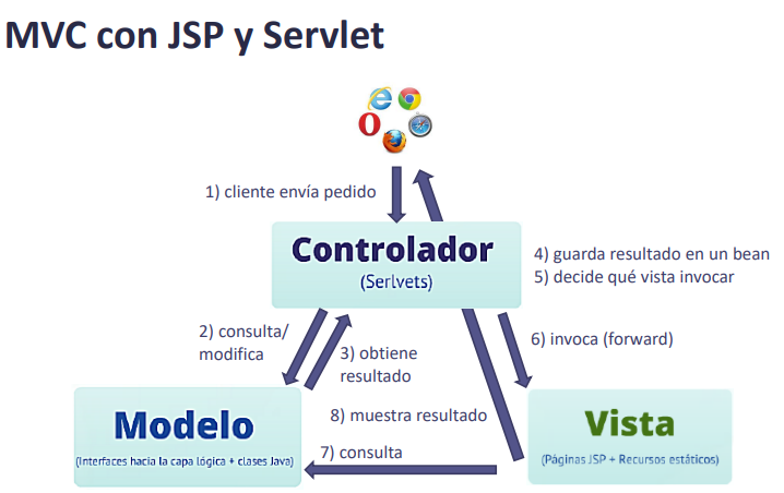
Patrones de Diseño
Como construir una aplicación Web que separe la lógica de Presentación... Flujo: Cliente consulta URL -> Servidor invoca capa lógica para consultar datos -> Se muestra una página particular.
La solución de esto es el patrón MVC: Model-View-Controller.
En el caso de Java, los controladores son los Servlets. El controlador es el que decide que vista invocar.
El modelo es el que mantiene los datos y maneja la lógica de negocio. El controlador invoca o modifica al modelo para obtener los datos para mostrar.
El controlador (servlet) invoca a una vista, la cual es una página jsp y recursos estáticos que muestra los recursos que decidió el controlador.
W3S HTML Tutorial
Simple html structure:
<!DOCTYPE html> //declaration defines that this document is an HTML5 document
<html>
<head>
<title>Page Title</title>
</head>
<body>

<h1>My First Heading</h1>
<p>My first paragraph.</p>

</body>
</html>
An element is defined by a start tag, content and an end tag:
<tagname>Content goes here...</tagname>
An html element is everything from the start tag to the end tag. Es importante notar que algunos elementos no tienen contenido. ¡¡¡Como el < br>, estos no tienen un end tag!!!
All HTML documents must start with a document type declaration: < !DOCTYPE html>. The HTML document itself begins with < html> and ends with < /html>. The visible part of the HTML document is between < body> and < /body>. The < !DOCTYPE> declaration is not case sensitive.
Tipos de elementos: Headings: se definen como < h**x**> con \(1 \geq x \leq 6\) . Párrafos: < p> ... < /p> Links: < a href="...">...< /a> . Lo que esta dentro del tag son los atributos. Imágenes: < img src="w3schools.jpg" alt="W3Schools.com" width="104" height="142"> Linebreak: < br> //No tiene end tag!
Todos los elementos HTML pueden anidarse.
HTML NO ES CASE SENSITIVE (W3C recomienda lowercase tho)
Atributos
Punteo general:
- All HTML elements can have attributes
- Attributes provide additional information about elements
- Attributes are always specified in the start tag
- Attributes usually come in name/value pairs like: name="value"
Ya vimos el href para links y el src para imágenes. El src puede ser un URL relativo o absoluto. Para las imágenes tenemos adicionalmente estos atributos:
- width, height, alt (alternate text for the image if it cannot be displayed)
En el html tag podemos especificar el lang, y en los párrafos un style= o un título. The title attribute defines some extra information about an element. The lang attribute of the < html> tag declares the language of the Web page.
Text Tags
Use HTML headings for headings only. Don't use headings to make text BIG or bold. Each HTML heading has a default size. However, you can specify the size for any heading with the style attribute, using the CSS font-size property.
The < hr> tag defines a thematic break in an HTML page, and is most often displayed as a horizontal rule. The < hr> element is used to separate content (or define a change) in an HTML page. The < hr> tag is an empty tag, which means that it has no end tag. Also use < br> if you want a line break (a new line) without starting a new paragraph.
The HTML < pre> element defines preformatted text. The text inside a < pre> element is displayed in a fixed-width font (usually Courier), and it preserves both spaces and line breaks:
<pre>
My Bonnie lies over the ocean.

My Bonnie lies over the sea.

My Bonnie lies over the ocean.

Oh, bring back my Bonnie to me.
</pre>
Use the style attribute for styling HTML elements Use background-color for background color Use color for text colors Use font-family for text fonts Use font-size for text sizes Use text-align for text alignment
For text formatting we have:
- < b> - Bold text
- < strong> - Important text
- < i> - Italic text
- < em> - Emphasized text
- < mark> - Marked text
- < small> - Smaller text
- < del> - Deleted text
- < ins> - Inserted text
- < sub> - Subscript text
- < sup> - Superscript text
Citation elements:
- < abbr> Defines an abbreviation or acronym
- < address> Defines contact information for the author/owner of a document
- < bdo> Defines the text direction
- < blockquote> Defines a section that is quoted from another source
- < cite> Defines the title of a work
- < q> Defines a short inline quotation
Se les agrega los atributos cite por ejemplo para mostrar información adicional sobre una cita. O title= Para dar el nombre de un acrónimo.
Los comentarios son ignorados por el procesador HTML su sintaxis es:
< !-- Write your comments here -->
Colores
HTML colors are specified with predefined color names, or with RGB, HEX, HSL, RGBA, or HSLA values. Hay distintas opciones para el color:
< p style="background-color:Tomato;">Lorem ipsum...< /p>
< p style="color:MediumSeaGreen;">Ut ipsum alu...< /p>
< h1 style="border:2px solid Violet;">Hello World< /h1>
RGB también incluye RGBA. Vale destacar que las gammas de grises son R=G=B :). En HEX se usa el rgb codificado como #rrggbb El HSL es algo raro que refiere a hsl(hue, saturation, lightness). Incluye un HSLA para el alfa channel si así se desea.
CSS mini
Tip: The word cascading means that a style applied to a parent element will also apply to all children elements within the parent. So, if you set the color of the body text to "blue", all headings, paragraphs, and other text elements within the body will also get the same color (unless you specify something else)!
CSS puede agregarse como inline (style=) de forma interna usando el < style> element dentro del < head> o de forma externa de la siguiente forma:
<!DOCTYPE html>
<html>
<head>
<link rel="stylesheet" href="styles.css">
</head>
<body>

<h1>This is a heading</h1>
<p>This is a paragraph.</p>

</body>
</html>
Atributos clásicos de CSS: color, font-family, font-size, border( 2px solid powderblue), etc. Algunos destacados:
- The CSS padding property defines a padding (space) between the text and the border (padding: 30px;).
- The CSS margin property defines a margin (space) outside the border (margin: 50px;).
Links
Se puede definir el comportamiento de los links:
- _self - Default. Opens the document in the same window/tab as it was clicked
- _blank - Opens the document in a new window or tab
- _parent - Opens the document in the parent frame
- _top - Opens the document in the full body of the window
Ejemplo:
<a href="https://www.w3schools.com/" target="_blank">Visit W3Schools!</a>
Un botón puede convertirse en un link:
<button onclick="document.location='default.asp'">HTML Tutorial</button>
Destacar este CSS que define el comportamiento de los links:
<style>
a:link {
color: green;
background-color: transparent;
text-decoration: none;
}

a:visited {
color: pink;
background-color: transparent;
text-decoration: none;
}

a:hover {
color: red;
background-color: transparent;
text-decoration: underline;
}

a:active {
color: yellow;
background-color: transparent;
text-decoration: underline;
}
</style>
active es cuando lo clikeamos (amarillo). Hover es cuando le pasamos el cursor, visited es cuando el ya lo visitamos, y link es el comportamiento por default.
Bookmarks
Bookmarks can be useful if a web page is very long. To create a bookmark - first create the bookmark, then add a link to it. When the link is clicked, the page will scroll down or up to the location with the bookmark.
Para esto necesitamos que el elemento donde queremos ir tenga id, luego la podemos referenciar poniéndole un # antes:
<h2 id="C4">Chapter 4</h2>
<a href="#C4">Jump to Chapter 4</a>
<a href="html_demo.html#C4">Jump to Chapter 4</a>
Images
- Use the HTML < img> element to define an image
- Use the HTML src attribute to define the URL of the image
- Use the HTML alt attribute to define an alternate text for an image, if it cannot be displayed
- Use the HTML width and height attributes or the CSS width and height properties to define the size of the image
- Use the CSS float property to let the image float to the left or to the right
Example:
<p><img src="smiley.gif" alt="Smiley face" style="float:left;width:42px;height:42px;">
The image will float to the left of the text.</p>
The HTML < map> tag defines an image map. An image map is an image with clickable areas. The areas are defined with one or more < area> tags. En esencia, podemos tener diferentes acciones dependiendo en las coordenadas de donde estamos parados en la imagen. The usemap value starts with a hash tag # followed by the name of the image map, and is used to create a relationship between the image and the image map.
Example:
<img src="workplace.jpg" alt="Workplace" usemap="#workmap">

<map name="workmap">
<area shape="rect" coords="34,44,270,350" alt="Computer" href="computer.htm">
<area shape="rect" coords="290,172,333,250" alt="Phone" href="phone.htm">
<area shape="circle" coords="337,300,44" alt="Coffee" href="coffee.htm">
</map>
La coordenada 0,0 es la coordenada del borde superior izquierdo. Notar que las coordenadas van de a pares. También podemos hacer que se ejecute javascript al clickear un área:
<map name="workmap">
<area shape="circle" coords="337,300,44" href="coffee.htm" onclick="myFunction()">
</map>

<script>
function myFunction() {
alert("You clicked the coffee cup!");
}
</script>
A todos los elementos se les puede poner un atributo background image. Este es configurable vía CSS.
The HTML < picture> element allows you to display different pictures for different devices or screen sizes. The < picture> element contains one or more < source> elements, each referring to different images through the srcset attribute. This way the browser can choose the image that best fits the current view and/or device. Each < source> element has a media attribute that defines when the image is the most suitable.
<picture>
<source media="(min-width: 650px)" srcset="img_food.jpg">
<source media="(min-width: 465px)" srcset="img_car.jpg">
<img src="img_girl.jpg">
</picture>
Note: Always specify an < img> element as the last child element of the < picture> element. The < img> element is used by browsers that do not support the < picture> element, or if none of the < source> tags match.
Los dos motivos centrales para esta es funcionalidad es para ahorrar ancho de banda para mostrar fotos más pequeñas cuando la pantalla también lo es (o viceversa) o para cargar fotos en distintos formatos cuando el navegador no soporta uno de estos.
Tables
HTML tables allow web developers to arrange data into rows and columns. Example:
<table>
<tr>
    <th>Company</th>
    <th>Contact</th>
    <th>Country</th>
</tr>
<tr>
    <td>Alfreds Futterkiste</td>
    <td>Maria Anders</td>
    <td>Germany</td>
</tr>
<tr>
    <td>Centro comercial Moctezuma</td>
    <td>Francisco Chang</td>
    <td>Mexico</td>
</tr>
</table>
Each table cell is defined by a < td> and a < /td> tag. (td=table data). Each table row starts with a < tr> and end with a < /tr> tag. (tr = table row)
Si quieres que alguna celda sea un header se puede reemplazar td por th. Por default quedan centrados y en negritas.
En CSS, para evitar el efecto de doble borde:
table, th, td {
border: 1px solid black;
border-collapse: collapse;
}
El atributo size="width:100%" en table indica how wide will this element be compared to its parent element, which can be the < body> element. A cada td/th/tr existen atributos css para poder customizar sus dimensiones. You can add a caption that serves as a heading for the entire table. Esta tiene que ir despues de table.
<table style="width:100%">
<caption>Monthly savings</caption>
<tr>
    <th style="width:70%">Firstname</th>
    <th>Lastname</th>
    <th>Age</th>
</tr>
</table>
Los atributos colspan y rowspan indican la cantidad de celdas que ocupa cada elemento th/td horizontalmente y verticalmente. Ejemplo:
<table>
<tr>
    <th>Name</th>
    <td>Jill</td>
</tr>
<tr>
    <th rowspan="2">Phone</th>
    <td>555-1234</td>
</tr>
<tr>
    <td>555-8745</td>
</tr>
</table>
Extra: Zebra-style effect:
tr:nth-child(even) {
background-color: #D6EEEE;
}
Color hover:
tr:hover {background-color: #D6EEEE;}
The < colgroup> element should be used as a container for the column specifications. Each group are specified with a < col> element. The span attribute specifies how many columns that gets the style. The style attribute specifies the style to give the columns.'
<table>
<colgroup>
    <col span="2" style="background-color: #D6EEEE">
</colgroup>
<tr>
    <th>MON</th>
    <th>TUE</th>
    <th>WED</th>
    <th>THU</th>
...
colgroup tiene que ir antes de la declaración de la tabla en si. (Pero despues del caption si hay alguno). Colgroup soporta pocas propriedades css, como width, visibility, background, border, visibility: collapse (oculta columnas), etc.
Lists
Uns lista sin orden es con el tag < ul> (unordered list) y cada element es < li> (list item). Una lista con orden es < ol>. Una description list es una lista con descripción de cada item. The < dl> tag defines the description list, the < dt> tag defines the term (name), and the < dd> tag describes each term:
<dl>
<dt>Coffee</dt>
<dd>- black hot drink</dd>
<dt>Milk</dt>
<dd>- white cold drink</dd>
</dl>
Lsd listas pueden ser anidadas. También se pueden tener listas horizontales. ¡¡¡Estas son muchas veces las barras de los menús!!! En las listas ordenadas el atributo type indica el marcador:
<ol type="1">
<li>Coffee</li>
<li>Tea</li>
<li>Milk</li>
</ol>
Un 1 indica números A o a indica letras (mayúsculas o minus), I o i indica números romanos en mayúsculas o minus respectivamente. default, an ordered list will start counting from 1. If you want to start counting from a specified number, you can use the start attribute.
Block & Inline
Every HTML element has a default display value, depending on what type of element it is. There are two display values: block and inline.
A block-level element always starts on a new line, always takes up the full width available (stretches out to the left and right as far as it can) and has a top and a bottom margin, whereas an inline element does not.
Ejemplos de block elements:
<address><article><aside><blockquote><canvas><dd><div><dl><dt><fieldset><figcaption><figure><footer><form><h1>-<h6><header><hr><li><main><nav><noscript><ol><p><pre><section><table><tfoot><ul><video>
Note: An inline element cannot contain a block-level element!
Div
The < div> element is often used as a container for other HTML elements. It has no required attributes, but style, class and id are common. When used together with CSS, the < div> element can be used to style blocks of content.
Span
The < span> element is an inline container used to mark up a part of a text, or a part of a document. The < span> element has no required attributes, but style, class and id are common. When used together with CSS, the < span> element can be used to style parts of the text:
<p>My mother has <span style="color:blue;font-weight:bold">blue</span> eyes and my father has <span style="color:darkolivegreen;font-weight:bold">dark green</span> eyes.</p>
Class
The HTML class attribute is used to specify a class for an HTML element. Multiple HTML elements can share the same class.
The class attribute is often used to point to a class name in a style sheet. It can also be used by a JavaScript to access and manipulate elements with the specific class name. In the following example we have three < div> elements with a class attribute with the value of "city". All of the three < div> elements will be styled equally according to the .city style definition in the head section:
<!DOCTYPE html>
<html>
<head>
<style>
.city {
background-color: tomato;
color: white;
border: 2px solid black;
margin: 20px;
padding: 20px;
}
</style>
</head>
<body>

<div class="city">
<h2>London</h2>
<p>London is the capital of England.</p>
</div>

<div class="city">
<h2>Paris</h2>
<p>Paris is the capital of France.</p>
</div>

<div class="city">
<h2>Tokyo</h2>
<p>Tokyo is the capital of Japan.</p>
</div>

</body>
</html>
To create a class; write a period (.) character, followed by a class name. Then, define the CSS properties within curly braces {}.Also, HTML elements can belong to more than one class. To define multiple classes, separate the class names with a space, e.g. < div class="city main">. The element will be styled according to all the classes specified. JavaScript can access elements with a specific class name with the getElementsByClassName("Name") method:
ID
The HTML id attribute is used to specify a unique id for an HTML element. You cannot have more than one element with the same id in an HTML document. The id attribute is used to point to a specific style declaration in a style sheet. It is also used by JavaScript to access and manipulate the element with the specific id. You can reference an element by id using the notation: #id. The id name is case sensitive! It is also used in bookmarks and in Javascript the función used is: getElementById("idName")
Example:
<style>
/* Style the element with the id "myHeader" */
#myHeader {
background-color: lightblue;
color: black;
padding: 40px;
text-align: center;
}

/* Style all elements with the class name "city" */
.city {
background-color: tomato;
color: white;
padding: 10px;
}
</style>

<!-- An element with a unique id -->
<h1 class="city" id="myHeader">My Cities</h1>
iFrames
An HTML iframe is used to display a web page within a web page:
<iframe src="demo_iframe.htm" height="200" width="300" title="Iframe Example"></iframe>
Los IFrames pueden usarse como targets (donde se va a abrir el sitio) en los < a>.
JavaScript mini
The HTML < script> tag is used to define a client-side script (JavaScript). The < script> element either contains script statements, or it points to an external script file through the src attribute. The HTML < noscript> tag defines an alternate content to be displayed to users that have disabled scripts in their browser or have a browser that doesn't support scripts:
<script>
document.getElementById("demo").innerHTML = "Hello JavaScript!";
</script>
<noscript>Sorry, your browser does not support JavaScript!</noscript>
Head
The < head> element is a container for metadata (data about data) and is placed between the < html> tag and the < body> tag. Metadata typically define the document title, character set, styles, scripts, and other meta information.
The < title> element defines the title of the document. The title must be text-only, and it is shown in the browser's title bar or in the page's tab. The < title> element is required in HTML documents!
The < style> element is used to define style information for a single HTML page. The < link> element defines the relationship between the current document and an external resource. The < link> tag is most often used to link to external style sheets:
<link rel="stylesheet" href="myStyle.css">
The < meta> element is typically used to provide search engines, browsers and webservices additional data. Examples:
<meta charset="UTF-8"> //Define the character set used
<meta name="keywords" content="HTML, CSS, JavaScript"> //for search engines
<meta name="description" content="Free Web tutorials"> //description of website
<meta name="author" content="John Doe">
<meta http-equiv="refresh" content="30">
<meta name="viewport" content="width=device-width, initial-scale=1.0"> //viewport to make your website look good on all devices
The viewport is the user's visible area of a web page. It varies with the device - it will be smaller on a mobile phone than on a computer screen. The width=device-width part sets the width of the page to follow the screen-width of the device (which will vary depending on the device). The initial-scale=1.0 part sets the initial zoom level when the page is first loaded by the browser.
The < base> element specifies the base URL and/or target for all relative URLs in a page. The < base> tag must have either an href or a target attribute present, or both:
<head>
<base href="https://www.w3schools.com/" target="_blank">
</head>

<body>
<img src="images/stickman.gif" width="24" height="39" alt="Stickman">
<a href="tags/tag_base.asp">HTML base Tag</a>
</body>
Layout
Websites often display content in multiple columns (like a magazine or a newspaper). HTML has several semantic elements that define the different parts of a web page:
<header> - Defines a header for a document or a section
<nav> - Defines a set of navigation links
<section> - Defines a section in a document
<article> - Defines an independent, self-contained content
<aside> - Defines content aside from the content (like a sidebar)
<footer> - Defines a footer for a document or a section
<details> - Defines additional details that the user can open and close on demand
<summary> - Defines a heading for the <details> element
Las técnicas para definir layouts son:
- CSS Framework (W3.css, bootstrap)
- CSS Float property (usando float and clear. Es fácil de usar, pero es un método bastante rígido)
- CSS Flexbox (es parecido a float pero permite ser más responsive para diferentes resoluciones)
- CSS Grid (Literalmente un sistema de columnas y filas que permite definir las posiciones de los elementos)
Responsive
Responsive Web Design is about using HTML and CSS to automatically resize, hide, shrink, or enlarge, a website, to make it look good on all devices (desktops, tablets, and phones). You need the meta tag viewport to provide information about the screen resolution for example:
<meta name="viewport" content="width=device-width, initial-scale=1.0">
En imágenes, trabajar con porcentaje los tamaños permite el diseño responsive:
<img src="img_girl.jpg" style="max-width:100%;height:auto;">
The text size can be set with a "vw" unit, which means the "viewport width". That way the text size will follow the size of the browser window:
<h1 style="font-size:10vw">Hello World</h1>
Un ejemplo clásico es el de media queries. With media queries you can define completely different styles for different browser sizes. Example: resize the browser window to see that the three div elements below will display horizontally on large screens and stacked vertically on small screens:
<style>
.left, .right {
float: left;
width: 20%; /* The width is 20%, by default */
}

.main {
float: left;
width: 60%; /* The width is 60%, by default */
}

/* Use a media query to add a breakpoint at 800px: */
@media screen and (max-width: 800px) {
.left, .main, .right {
    width: 100%; /* The width is 100%, when the viewport is 800px or smaller */
}
}
</style>
Por suerte hay frameworks que simplifican todo esto: Un CSS framework is Bootstrap. Bootstrap uses HTML, CSS and jQuery to make responsive web pages. For example, look at this crap:
<!DOCTYPE html>
<html lang="en">
<head>
<title>Bootstrap Example</title>
<meta charset="utf-8">
<meta name="viewport" content="width=device-width, initial-scale=1">
<link rel="stylesheet" href="https://maxcdn.bootstrapcdn.com/bootstrap/3.4.1/css/bootstrap.min.css">
<script src="https://ajax.googleapis.com/ajax/libs/jquery/3.5.1/jquery.min.js"></script>
<script src="https://maxcdn.bootstrapcdn.com/bootstrap/3.4.1/js/bootstrap.min.js"></script>
</head>
<body>

<div class="container">
<div class="jumbotron">
    <h1>My First Bootstrap Page</h1>
</div>
<div class="row">
    <div class="col-sm-4">
    ...
    </div>
    <div class="col-sm-4">
    ...
    </div>
    <div class="col-sm-4">
    ...
    </div>
</div>
</div>

</body>
</html>
ComputerCode
HTML contains several elements for defining user input and computer code. The HTML < code> element is used to define a piece of computer code (We use < pre> to preserve linebreaks and spaces):
<pre>
<code>
x = 5;
y = 6;
z = x + y;
</code>
</pre>
The HTML < kbd> element is used to define keyboard input. The content inside is displayed in the browser's default monospace font:
<p>Save the document by pressing <kbd>Ctrl + S</kbd></p>
The HTML < samp> element is used to define sample output from a computer program. The content inside is displayed in the browser's default monospace font:
<p>Message from my computer:</p>
<p><samp>File not found.<br>Press F1 to continue</samp></p>
The HTML < var> element is used to define a variable in programming or in a mathematical expression. The content inside is typically displayed in italic.
Semantics
According to the W3C: "A semantic Web allows data to be shared and reused across applications, enterprises, and communities."
A semantic element clearly describes its meaning to both the browser and the developer. Examples of non-semantic elements: < div> and < span> - Tells nothing about its content. Examples of semantic elements: < form>, < table>, and < article> - Clearly defines its content.
Many web sites contain HTML code like: < div id="nav"> < div class="header"> < div id="footer"> to indicate navigation, header, and footer.
List of semantic elements:
<article> // specifies independent, self-contained content. An article should make sense on its own, and it should be possible to distribute it independently from the rest of the web site.
<aside> // defines some content aside from the content it is placed in (like a sidebar).
<details> //	Defines additional details that the user can view or hide
<figcaption> tag defines a caption for a <figure> element. First or last child of figure element
<figure> //  tag specifies self-contained content, like illustrations, diagrams, photos, code listings, etc.
<footer> // defines a footer for a document or section.
<header> // represents a container for introductory content or a set of navigational links.
<main> // Specifies the main content of a document
<mark> // 	Defines marked/highlighted text
<nav> // defines a set of navigation links.
<section> //A section is a thematic grouping of content, typically with a heading.
<summary> // 	Defines a visible heading for a <details> element
<time>
Style
- Always Declare Document Type
- Use Lowercase Element Names
- Close All HTML Elements
- Use Lowercase Attribute Names
- Always Quote Attribute Values
- Always Specify alt, width, and height for Images
- No spaces between equal signs
- Avoid Long Code Lines / Don't add blank lines, spaces or identation whitout a reason.
- Never Skip the < title> Element
- Don't omit html,body nor head.
- Always close empty elements.
- Add the lang Attribute and proper metadata (charset,viewport)
- Use simple sintax for loading CSS & Javascript
- Use .html, .css, .js extensions
- Consider that web servers might treat files case sensitive (Apache) or case insensitive (Microsoft IIE)
Entities
Character entities are used to display reserved characters in HTML. To not confuse < > with tags, to display a less than sign (<) we must write: & lt; or & #60;
A character entity looks like:
&entity_name;
OR

&#entity_number;
A common entity is & nbsp; which is used to not create a new line after such space. Useful for sticking together two words. If you write 10 spaces in your text, the browser will remove 9 of them. To add real spaces to your text, you can use the & nbsp; character entity.
Table of entities:
non-breaking space  
< less than < <
> greater than > >
& ampersand & &
" double quotation mark " "
' single quotation mark (apostrophe) ' '
¢ cent ¢ ¢
£ pound £ £
¥ yen ¥ ¥
€ euro € €
© copyright © ©
® registered trademark ® ®
You can add diacritical marks as entities like this:
̀	a	à	à
́	a	á	á
̂	a	â	â
̃	a	ã	ã
̀	O	Ò	Ò
́	O	Ó	Ó
̂	O	Ô	Ô
̃	O	Õ	Õ
Symbols that are not present on your keyboard can also be added by using entities. To add such symbols to an HTML page, you can use the entity name or the entity number (a decimal or a hexadecimal reference) for the symbol. Examples:
∀	∀	∀	FOR ALL
∂	∂	∂	PARTIAL DIFFERENTIAL
∃	∃	∃	THERE EXISTS
∅	∅	∅	EMPTY SETS
∇	∇	∇	NABLA
∈	∈	∈	ELEMENT OF
∉	∉	∉	NOT AN ELEMENT OF
∋	∋	∋	CONTAINS AS MEMBER
∏	∏	∏	N-ARY PRODUCT
∑	∑	∑	N-ARY SUMMATION
Letters can also be treated as entities. For example: A = A (In UTF-8). Emojis can be added using this technique: Happy face = & #128512;
The HTML5 specification encourages web developers to use the UTF-8 character set, which covers almost all of the characters and symbols in the world!
Because URLs can only be sent over the Internet using the ASCII character-set. If a URL contains characters outside the ASCII set, the URL has to be converted. URL encoding replaces non-ASCII characters with a "%" followed by hexadecimal digits. URLs cannot contain spaces. URL encoding normally replaces a space with a plus (+) sign, or %20.
XHTML
XHTML is a stricter, more XML-based version of HTML, stands for EXtensible HyperText Markup Language. XHTML was developed to make HTML more extensible and flexible to work with other data formats (such as XML). In addition, browsers ignore errors in HTML pages, and try to display the website even if it has some errors in the markup. So, XHTML comes with a much stricter error handling.
Differences:
<!DOCTYPE> is mandatory
The xmlns attribute in <html> is mandatory
<html>, <head>, <title>, and <body> are mandatory
Elements must always be properly nested
Elements must always be closed
Elements must always be in lowercase
Attribute names must always be in lowercase
Attribute values must always be quoted
Attribute minimization is forbidden
Forms
Attributes
An HTML form is used to collect user input. The user input is most often sent to a server for processing. The < form> element is a container for different types of input elements, such as: text fields, checkboxes, radio buttons, submit buttons, etc. An element can be displayed in many ways, depending on the type attribute:
<input type="text">	Displays a single-line text input field
<input type="radio">	Displays a radio button (for selecting ONE of many choices)
<input type="checkbox">	Displays a checkbox (for selecting ZERO or MORE of many choices)
<input type="submit">	Displays a submit button (for submitting the form)
<input type="button">	Displays a clickable button
The < label> tag defines a label for many form elements. It's useful for screen-reader users, because the screen-reader will read out loud the label when the user focus on the input element. The for attribute of the < label> tag should be equal to the id attribute of the < input> element to bind them together:
<form>
<label for="fName">First name:</label><br>
<input type="text" id="fName" name="fName"><br>
<label for="lName">Last name:</label><br>
<input type="text" id="lName" name="lName">
</form>
The < input type="submit"> defines a button for submitting the form data to a form-handler. The form-handler is typically a file on the server with a script for processing input data. The form-handler is specified in the form's action attribute (If the action attribute is omitted, the action is set to the current page): The action attribute defines the action to be performed when the form is submitted, the target attribute specifies where to display the response that is received after submitting the form. The method attribute specifies the HTTP method to be used when submitting the form data, it can be GET (default) or POST. The autocomplete lets browsers autocomplete values. The novalidate attribute is a boolean attribute, it specifies that the form-data (input) should not be validated when submitted.
<form action="/action_page.php" target="_self" method="post" autocomplete="on" novalidate>
<label for="fName">First name:</label><br>
<input type="text" id="fName" name="fName" value="John"><br>
<label for="lName">Last name:</label><br>
<input type="text" id="lName" name="lName" value="Doe"><br><br>
<input type="submit" value="Submit">
</form>
the attribute "name" is required for submitting the input. Types of targets are defined in the links section. Here are some considerations to choose the correct HTTP method for a form:
GET:
- Appends the form data to the URL, in name/value pairs
- NEVER use GET to send sensitive data! (the submitted form data is visible in the URL!)
- The length of a URL is limited (2048 characters)
- Useful for form submissions where a user wants to bookmark the result
- GET is good for non-secure data, like query strings in Google
POST:
- Appends the form data inside the body of the HTTP request (the submitted form data is not shown in the URL)
- POST has no size limitations, and can be used to send large amounts of data.
- Form submissions with POST cannot be bookmarked
Extra list of form attributes:
accept-charset	Specifies the character encodings used for form submission
action	Specifies where to send the form-data when a form is submitted
autocomplete	Specifies whether a form should have autocomplete on or off
enctype	Specifies how the form-data should be encoded when submitting it to the server (only for method="post")
method	Specifies the HTTP method to use when sending form-data
name	Specifies the name of the form
novalidate	Specifies that the form should not be validated when submitted
rel	Specifies the relationship between a linked resource and the current document
target	Specifies where to display the response that is received after submitting the form
Elements
The elements that can be inside are form are: input, label, select, textarea, button, fieldset, legend, datalist, option, output, optgroup. Input is the most popular and can be displayed in several ways depending on the type attribute.
The < select> element defines a drop-down list, which contains < option> elements that define an option that can be selected. It is the html version of the JComboBox, Use the size attribute to specify the number of visible values. The multiple attribute allow the user to select more than one value.
<label for="cars">Choose a car:</label>
<select id="cars" name="cars" size="3" multiple>
<option value="volvo">Volvo</option>
<option value="saab">Saab</option>
<option value="fiat">Fiat</option>
<option value="audi">Audi</option>
</select>
The < textarea> element defines a multi-line input field (a text area, jTextField). The size is defined by rows and cols (can also be defined with CSS):
<textarea name="message" rows="10" cols="30">
The cat was playing in the garden.
</textarea>
The < fieldset> element is used to group related data in a form. The < legend> element defines a caption for the < fieldset> element. Son esos recuadros que engloban contenido y tienen un mini titulo:
<form action="/action_page.php">
<fieldset>
    <legend>Personalia:</legend>
    <label for="fName">First name:</label><br>
    <input type="text" id="fName" name="fName" value="John"><br>
    <label for="lName">Last name:</label><br>
    <input type="text" id="lName" name="lName" value="Doe"><br><br>
    <input type="submit" value="Submit">
</fieldset>
</form>
The < datalist> element specifies a list of pre-defined options for an < input> element. Users will see a drop-down list of the pre-defined options as they input data. The list attribute of the < input> element, must refer to the id attribute of the < datalist> element. Es el famoso textfield inteligente:
<form action="/action_page.php">
<input list="browsers">
<datalist id="browsers">
    <option value="Internet Explorer">
    <option value="Firefox">
    <option value="Chrome">
    <option value="Opera">
    <option value="Safari">
</datalist>
</form>
The < output> element represents the result of a calculation (like one performed by a script). Displays dynamically the result using intelligent scripting.
Input types
By default, an input is of type text. This is a list of possible types:
<input type="button">
<input type="checkbox"> //Checkboxes let a user select ZERO or MORE options of a limited number of choices.
<input type="color"> //Depending on browser support, a color picker can show up in the input field.
<input type="date"> //Depending on browser support, a date picker can show up in the input field.
<input type="datetime-local"> //The <input type="datetime-local"> specifies a date and time input field, with no time zone, a date picker can show up in the input field.
<input type="email">  //Depending on browser support, the e-mail address can be automatically validated when submitted.
<input type="file"> //defines a file-select field and a "Browse" button for file uploads.
<input type="hidden"> //A hidden field let web developers include data that cannot be seen or modified by users when a form is submitted. (but can be seen in the HTML!)
<input type="image">
<input type="month"> //The <input type="month"> allows the user to select a month and year, a date picker can show up in the input field.
<input type="number"> //The <input type="number"> defines a numeric input field, it can be restricted with min/max.
<input type="password"> //The characters in a password field are masked (shown as asterisks or circles)
<input type="radio"> //Radio buttons let a user select ONLY ONE of a limited number of choices
<input type="range"> //The <input type="range"> defines a control for entering a number whose exact value is not important (like a slider control). Default 0-100.
<input type="reset"> //defines a reset button that will reset all form values to their default values (lo especificado en value= en cada input)
<input type="search"> // The <input type="search"> is used for search fields (a search field behaves like a regular text field).
<input type="submit"> //defines a button for submitting form data to a form-handler.
<input type="tel"> //is used for input fields that should contain a telephone number.
<input type="text"> //defines a single-line text input field
<input type="time"> //allows the user to select a time (no time zone), a time picker can show up in the input field.
<input type="url"> //Depending on browser support, the url field can be automatically validated when submitted.
<input type="week"> //The <input type="week"> allows the user to select a week and year.
Dates can be restricted with min max attributes:
<form>
<label for="datemax">Enter a date before 1980-01-01:</label>
<input type="date" id="datemax" name="datemax" max="1979-12-31"><br><br>
<label for="datemin">Enter a date after 2000-01-01:</label>
<input type="date" id="datemin" name="datemin" min="2000-01-02">
</form>
This is a list of other input restrictions:
checked	    Specifies that an input field should be pre-selected when the page loads (for type="checkbox" or type="radio")
disabled	Specifies that an input field should be disabled
max	        Specifies the maximum value for an input field
maxlength	Specifies the maximum number of characters for an input field
min	        Specifies the minimum value for an input field
pattern	    Specifies a regular expression to check the input value against
readonly	Specifies that an input field is read only (cannot be changed)
required	Specifies that an input field is required (must be filled out)
size	    Specifies the width (in characters) of an input field
step    	Specifies the legal number intervals for an input field
value	    Specifies the default value for an input field
Input Attributes
The input value attribute specifies an initial value for an input field. The input readonly attribute specifies that an input field is read-only (however, a user can tab to it, highlight it, and copy the text from it), it will be sent when submitted. However, the disabled attribute specifies that the input is unusable and un-clickable and the input field will NOT be sent!
The size attr indicates the size of the input. The input maxlength attribute specifies the maximum number of characters allowed in an input field, however it doesn't provide feedback (you need to add a javascript to alert the user). The input pattern attribute specifies a regular expression that the input field's value is checked against, when the form is submitted. The input placeholder attribute specifies a short hint that describes the expected value of an input field (a sample value or a short description of the expected format). The short hint is displayed in the input field before the user enters a value. The input required attribute specifies that an input field must be filled out before submitting the form:
<form>
<label for="country_code">Country code:</label>
<input type="text" id="country_code" name="country_code"
pattern="[A-Za-z]{3}" placeholder="123-45-678" title="Three letter country code" required>
</form>
The input step attribute specifies the legal number intervals for an input field. The input autofocus attribute specifies that an input field should automatically get focus when the page loads. The input height and width attributes specify the height and width of an < input type="image"> element.
Tip: Always specify both the height and width attributes for images. If height and width are set, the space required for the image is reserved when the page is loaded. Without these attributes, the browser does not know the size of the image, and cannot reserve the appropriate space to it. The effect will be that the page layout will change during loading (while the images load).
Note: Input restrictions are not foolproof, and JavaScript provides many ways to add illegal input. To safely restrict input, it must also be checked by the receiver (the server)!
The input formaction attribute specifies the URL of the file that will process the input when the form is submitted. Note: This attribute overrides the action attribute of the < form> element. The input formenctype attribute specifies how the form-data should be encoded when submitted (only for forms with method="post") and overrides the enctype of the form element:
<form action="/action_page.php">
<label for="lName">Last name:</label>
<input type="text" id="lName" name="lName"><br><br>
<input type="submit" value="Submit">
<input type="submit" formaction="/action_page2.php" value="Submit as Admin" formenctype="multipart/form-data" formnovalidate="formnovalidate">
</form>
The formmethod attribute defines the http method for sending form-data, overrides the method attr of the form element. Same for formtarget which also overrides the form element. The input formnovalidate attribute specifies that an < input> element should not be validated when submitted (overrides the novalidate form attr).
Graphics
Canvas
The HTML
To define a canvas just:
<canvas id="myCanvas" width="200" height="100"></canvas>
To draw on it you need a script:
<script>
var c = document.getElementById("myCanvas");
var ctx = c.getContext("2d");
ctx.moveTo(0, 0);
ctx.lineTo(200, 100);
ctx.stroke();
</script>
There are many functions and methods for drawing graphics with javascript.
SVG
SVG stands for Scalable Vector Graphics, define graphics for the Web by recommendation of the W3C consortium.
The HTML < svg> element is a container for SVG graphics. SVG has several methods for drawing paths, boxes, circles, text, and graphic images. Example of an SVG star:
<svg width="300" height="200">
<polygon points="100,10 40,198 190,78 10,78 160,198"
style="fill:lime;stroke:purple;stroke-width:5;fill-rule:evenodd;" />
</svg>
SVG is a language for describing 2D graphics in XML. Whereas Canvas draws 2D graphics, on the fly (with a JavaScript).
SVG is XML based, which means that every element is available within the SVG DOM. You can attach JavaScript event handlers for an element. In SVG, each drawn shape is remembered as an object. If attributes of an SVG object are changed, the browser can automatically re-render the shape. On the other hand, Canvas is rendered pixel by pixel. In canvas, once the graphic is drawn, it is forgotten by the browser. If its position should be changed, the entire scene needs to be redrawn, including any objects that might have been covered by the graphic.
Canvas:
- Resolution dependent
- No support for event handlers
- Poor text rendering capabilities
- You can save the resulting image as .png or .jpg
- Well suited for graphic-intensive games
SVG:
- Resolution independent
- Support for event handlers
- Best suited for applications with large rendering areas (Google Maps)
- Slow rendering if complex (anything that uses the DOM a lot will be slow)
- Not suited for game applications
HTML Multimedia
Multimedia comes in many different formats. It can be almost anything you can hear or see, like images, music, sound, videos, records, films, animations, and more. Multimedia elements (like audio or video) are stored in media files.
The HTML standard supports the following formats:
- Video: MP4, WebM, Ogg
- Audio: MP3, WAV, Ogg audio
To show a video in HTML, use the < video> element. The controls attribute adds video controls, like play, pause, and volume. If height and width are not set, the page might flicker while the video loads. The < source> element allows you to specify alternative video files which the browser may choose from. The browser will use the first recognized format. Text is displayed if browser does not support the < video> element. Autoplay attr autoplays the video xd, muted starts the video without volume.
<video width="320" height="240" controls autoplay muted>
<source src="movie.mp4" type="video/mp4">
<source src="movie.ogg" type="video/ogg">
Your browser does not support the video tag.
</video>
Note: Chromium browsers do not allow autoplay in most cases. However, muted autoplay is always allowed.
The HTML
Plug-ins
lug-ins are computer programs that extend the standard functionality of the browser. Plug-ins were designed to be used for many different purposes:
To run Java applets
To run Microsoft ActiveX controls
To display Flash movies
To display maps
To scan for viruses
To verify a bank id
Warning ! Most browsers no longer support Java Applets and Plug-ins. ActiveX controls are no longer supported in any browsers. The support for Shockwave Flash has also been turned off in modern browsers.
The < object> element defines an embedded object within an HTML document. It was designed to embed plug-ins (like Java applets, PDF readers, and Flash Players) in web pages, but can also be used to include HTML in HTML:
<object data="audi.jpeg"></object>
The < embed> element also defines an embedded object within an HTML document (Note that the < embed> element does not have a closing tag. It can not contain alternative text)
<embed src="audi.jpeg">
You can play youtube videos using an iframe:
<iframe width="420" height="315"
src="https://www.youtube.com/embed/tgbNymZ7vqY?autoplay=1&mute=1?controls=0">
</iframe>
APIs
**Check that the browsers supports the following APIs before trying to use them!! Always have some catch code when such cases happen.
Geolocation
The HTML Geolocation API is used to get the geographical position of a user. Since this can compromise privacy, the position is not available unless the user approves it. Works best in smartphones (devices with GPS).
Note: As of Chrome 50, the Geolocation API will only work on secure contexts such as HTTPS. If your site is hosted on an non-secure origin (such as HTTP) the requests to get the users location will no longer function.
Example:
<script>
var x = document.getElementById("demo");
function getLocation() {
if (navigator.geolocation) { //Check if Geolocation is supported
    navigator.geolocation.getCurrentPosition(showPosition); //returns a coordinates object to the function specified in the parameter (showPosition)
} else {
    x.innerHTML = "Geolocation is not supported by this browser.";
}
}

function showPosition(position) { //The showPosition() function outputs the Latitude and Longitude
x.innerHTML = "Latitude: " + position.coords.latitude +
"<br>Longitude: " + position.coords.longitude;
}
</script>
Drag/Drop
In HTML, any element can be dragged and dropped. rag and drop is a very common feature. It is when you "grab" an object and drag it to a different location. Example:
<!DOCTYPE HTML>
<html>
<head>
<script>

//By default, data/elements cannot be dropped in other elements. To allow a drop, we must prevent the default handling of the element.
//This is done by calling the event.preventDefault() method for the on dragover event.
function allowDrop(ev) {
ev.preventDefault();
}

function drag(ev) {
ev.dataTransfer.setData("text", ev.target.id); //sets the data type and the value of the dragged data.
}

function drop(ev) {
ev.preventDefault(); // prevent the browser default handling of the data (default is open as link on drop)
var data = ev.dataTransfer.getData("text"); //Get the dragged data
ev.target.appendChild(document.getElementById(data)); //Append the dragged element into the drop element
}
</script>
</head>
<body>

<div id="div1" onDrop="drop(event)" onDragOver="allowDrop(event)"></div> //onDragOver event specifies where the dragged data can be dropped.

//To make an element draggable, set the draggable attribute to true,Then, specify what should happen when the element is dragged.
<img id="drag1" src="img_logo.gif" draggable="true" onDragStart="drag(event)" width="336" height="69">

</body>
</html>
WebStorage
With web storage, web applications can store data locally within the user's browser. Before HTML5, application data had to be stored in cookies, included in every server request. Web storage is more secure, and large amounts of data can be stored locally, without affecting website performance. Unlike cookies, the storage limit is far larger (at least 5MB) and information is never transferred to the server. Web storage is per origin (per domain and protocol). All pages, from one origin, can store and access the same data.
There are two web storage objects:
- window.localStorage - stores data with no expiration date. The data will not be deleted when the browser is closed.
- window.sessionStorage - stores data for one session (data is lost when the browser tab is closed)
Usage Example:
// Store
localStorage.setItem("lastname", "Smith");
// Retrieve
document.getElementById("result").innerHTML = localStorage.getItem("lastname");
// Remove
localStorage.removeItem("lastname");
Note: Name/value pairs are always stored as strings. Remember to convert them to another format when needed!
WebWorkers
When executing scripts in an HTML page, the page becomes unresponsive until the script is finished. A web worker is a JavaScript that runs in the background, independently of other scripts, without affecting the performance of the page. You can continue to do whatever you want: clicking, selecting things, etc., while the web worker runs in the background.
the postMessage() method is used to post a message back to the HTML page in a script. Example of web worker:
function timedCount() {
    i = i + 1;
    postMessage(i);
    setTimeout("timedCount()",500);
}

if (typeof(w) == "undefined") { //The following lines checks if the worker already exists
    w = new Worker("demo_workers.js"); // creates a new web worker object and runs the code in "demo_workers.js":
}

w.onmessage = function(event){ //Add an "onmessage" event listener to the web worker.
    document.getElementById("result").innerHTML = event.data;
};

w.terminate(); //To terminate a web worker
SSE API
Server-Sent Events (SSE) allow a web page to get updates from a server. This was also possible before, but the web page would have to ask if any updates were available. With server-sent events, the updates come automatically. Examples: Facebook/Twitter updates, stock price updates, news feeds, sport results, etc.
The EventSource object is used to receive server-sent event notifications:
var source = new EventSource("demo_sse.php"); //Create a new EventSource object, and specify the URL of the page sending the updates
source.onmessage = function(event) { //Each time an update is received, the onmessage event occurs
  document.getElementById("result").innerHTML += event.data + "<br>";
};
The server-side event stream syntax is simple. Set the "Content-Type" header to "text/event-stream". Now you can start sending event streams. Example of a PHP server:
<?php
header('Content-Type: text/event-stream');
header('Cache-Control: no-cache');

$time = date('r');
echo "data: The server time is: {$time}\n\n"; // (**Always** start with "data: ")
flush();
?>
W3S CSS Tutorial
A CSS rule consists of a selector and a declaration block:
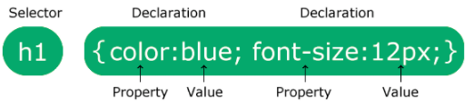
The selector points to the HTML element you want to style. The declaration block contains one or more declarations separated by semicolons. Each declaration includes a CSS property name and a value, separated by a colon. Multiple CSS declarations are separated with semicolons, and declaration blocks are surrounded by curly braces.
Selectors
CSS selectors are used to "find" (or select) the HTML elements you want to style. Can be divided in 5 categories:
Simple selectors            (select elements based on name, id, class)
Combinator selectors        (select elements based on a specific relationship between them)
Pseudo-class selectors      (select elements based on a certain state)
Pseudo-elements selectors   (select and style a part of an element)
Attribute selectors         (select elements based on an attribute or attribute value)
The element selector selects HTML elements based on the element name:
p { //Affects all <p> elements
text-align: center;
color: red;
}
The id selector uses the id attribute of an HTML element to select a specific element. To select an element with a specific id, write a hash (#) character, followed by the id of the element:
#para1 {
text-align: center;
color: red;
}
The class selector selects HTML elements with a specific class attribute. To select elements with a specific class, write a period (.) character, followed by the class name:
.center {
text-align: center;
color: red;
}
Selectors can be combined:
p.center {              //only <p> elements with class="center" will be red and center-aligned.
text-align: center;
color: red;
}
The universal selector (*) selects all HTML elements on the page:
* {
text-align: center;
color: blue;
}
To group selectors, separate each selector with a comma:
h1, h2, p {
text-align: center;
color: red;
}
Stylesheets
If some properties have been defined for the same selector (element) in different style sheets, the value from the last read style sheet will be used. What style will be used when there is more than one style specified for an HTML element?
All the styles in a page will "cascade" into a new "virtual" style sheet by the following rules, where number one has the highest priority:
- Inline style (inside an HTML element)
- External and internal style sheets (in the head section)
- Browser default
Comments are written with the C block sintax: /* */
Colour
CSS use colour sintax in the same way as HTML (rgb, hex and hsl)
You can also define the opacity of elements (alpha channel) with the opacity: property (1-0). Some advanced keywords for colors are:
- inherit: specifies that a property should inherit its value from its parent element.
- currentcolor: is like a variable that holds the current value of the color property of an element.
- transparent: transparent keyword is used to make a color transparent.
There are also functions to define gradients. Examples:
background-image: linear-gradient(direction, color-stop1, color-stop2, ...);
radial-gradient(shape size at position, start-color, ..., last-color);

background-image: linear-gradient(to right, rgba(255,0,0,0), rgba(255,0,0,1));
background-image: repeating-linear-gradient(red, yellow 10%, green 20%);
background-image: radial-gradient(circle, red, yellow, green);
You can apply shadows to text and elements with the following properties:
box-shadow	Adds one or more shadows to an element
text-shadow	Adds one or more shadows to a text
Example:
div {
box-shadow: 10px 10px 5px grey;
}
Backgrounds
The CSS background properties are used to add background effects for elements. Properties:
background-color        //color of an element.
opacity                 //The opacity property specifies the opacity/transparency of an element.
background-image        // Syntax: background-image: url("paper.gif");
background-repeat       //  repeats an image both horizontally and vertically. Syntax:   background-repeat: repeat-(x|y) | no-repeat;
background-attachment   // The background-attachment property specifies whether the background image should scroll or be fixed. background-attachment: fixed/scroll;
background-position     // specify the position of the background image. Example: background-position: right top;
background (shorthand property) //Simplifies CSS:  background: #ffffff url("img_tree.png") no-repeat right top;
CSS allows you to add multiple background images for an element, through the background-image property. The different background images are separated by commas, and the images are stacked on top of each other, where the first image is closest to the viewer:
#example1 {
background-image: url(img_DOGGO.gif), url(paper.gif);
background-position: right bottom, left top;
background-repeat: no-repeat, repeat;
background-size: contain; //contain makes the image fit the width, cover just put the image there.
}
Some other advanced background properties:
background      	A shorthand property for setting all the background properties in one declaration
background-clip	    Specifies the painting area of the background. It can be border/padding/content (see the box model)
background-image	Specifies one or more background images for an element
background-origin	Specifies where the background image(s) is/are positioned
background-size	    Specifies the size of the background image(s)
Borders
The border-style property specifies what kind of border to display.
The following values are allowed:
dotted - Defines a dotted border
dashed - Defines a dashed border
solid - Defines a solid border
double - Defines a double border
groove - Defines a 3D grooved border. The effect depends on the border-color value
ridge - Defines a 3D ridged border. The effect depends on the border-color value
inset - Defines a 3D inset border. The effect depends on the border-color value
outset - Defines a 3D outset border. The effect depends on the border-color value
none - Defines no border
hidden - Defines a hidden border
Example: p.dashed {border-style: dashed;} Borders can be combined:
border-style: dotted solid double dashed;
    top border is dotted
    right border is solid
    bottom border is double
    left border is dashed
It is required to specify the style to add the following properties.
The border-width property specifies the width of the four borders. The width can be set as a specific size (in px, pt, cm, em, etc) or by using one of the three pre-defined values: thin, medium, or thick:
border-width: 25px 10px 4px 35px; /* 25px top, 10px right, 4px bottom and 35px left */
Border color specifies... the colours of the border:
border-color: red green blue yellow; /* red top, green right, blue bottom and yellow left */
As background, border property resumes all border properties:
p {
border-left: 6px solid red;
background-color: lightgrey;
}
px {
border: 5px solid red;
border-radius: 5px;
}
The border-radius property is used to add rounded borders to an element. You can specify for each corner the radius you want:
#corner {
border-radius: 15px 10px 50px 30px;
background: #73AD21;
padding: 20px;
width: 200px;
height: 150px;
}
With the CSS border-image property, you can set an image to be used as the border around an element:
#borderImg {
border: 10px solid transparent;
padding: 15px;
border-image: url(border.png) 30 round;
}
Margin
The CSS margin properties are used to create space around elements, outside of any defined borders. With CSS, you have full control over the margins. There are properties for setting the margin for each side of an element (top, right, bottom, and left).
p {
margin-top: 100px;
margin-bottom: 100px;
margin-right: 150px;
margin-left: 80px;
}
Alternatively:
p{
    margin: 100px 100px 150px 80px
}
All the margin properties can have the following values:
auto        - the browser calculates the margin
length      - specifies a margin in px, pt, cm, etc.
%           - specifies a margin in % of the width of the containing element
inherit     - specifies that the margin should be inherited from the parent element
You can have negative margins.
Margin Collapse Top and bottom margins of elements are sometimes collapsed into a single margin that is equal to the largest of the two margins. This does not happen on left and right margins! Only top and bottom margins!
Example:
h1 {
margin: 0 0 50px 0;
}

h2 {
margin: 20px 0 0 0;
}
The space between h1 and h2 is not 50+20px but max(50,20)px!!!
Padding
Padding is used to create space around an element's content, inside of any defined borders. It can be defined in px,pt,cm, with % or using inherit. Padding is the shorthand. Example:
div {
padding-top: 50px;
padding-right: 30px;
padding-bottom: 50px;
padding-left: 80px;
}
OR
div {
padding: 25px 50px 75px 100px;
}
To avoid conflicts with padding and with you have to use the box sizing property. This causes the element to maintain its actual width; if you increase the padding, the available content space will decrease:
div {
width: 300px;
padding: 25px;
box-sizing: border-box;
}
Height and Width
The CSS height and width properties are used to set the height and width of an element. The CSS max-width property is used to set the maximum width of an element. The height and width properties may have the following values:
auto        - This is default. The browser calculates the height and width
length      - Defines the height/width in px, cm etc.
%           - Defines the height/width in percent of the containing block
initial     - Sets the height/width to its default value
inherit     - The height/width will be inherited from its parent value
Remember that the height and width properties do not include padding, borders, or margins! They set the height/width of the area inside the padding, border, and margin of the element!
Box Model
In CSS, the term "box model" is used when talking about design and layout. The CSS box model is essentially a box that wraps around every HTML element. It consists of: margins, borders, padding, and the actual content. The image below illustrates the box model:
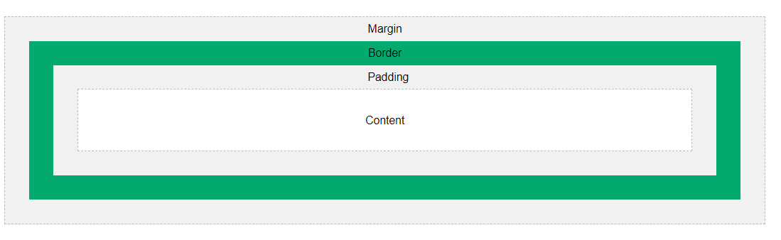
Outline
An outline is a line drawn outside the element's border. It has similar semantics and syntax to the border. But unlike border, the outline is drawn outside the element's border, and may overlap other content. Also, the outline is NOT a part of the element's dimensions; the element's total width and height is not affected by the width of the outline.
Properties: outline-style, outline-color, outline-width, outline-offset and outline (Shorthand). The outline-offset property adds space between an outline and the edge/border of an element. The space between an element and its outline is transparent. En example of outline:
p {
margin: 30px;
background: yellow;
border: 1px solid black;
outline: 1px solid red;
outline-offset: 15px;
}
Text
The color property is used to set the color of the text.
Note: For W3C compliant CSS: If you define the color property, you must also define the background-color.
body {
background-color: lightgrey;
color: blue;
}
The text-align property is used to set the horizontal alignment of a text. A text can be left or right aligned, centred, or justified. he direction and unicode-bidi properties can be used to change the text direction of an element:
p {
direction: rtl;
unicode-bidi: bidi-override;
}
The vertical-align property sets the vertical alignment of an element. Examples are: baseline, text-top, text-bottom, sub and super. The text-decoration property is used to set or remove decorations from text. The value text-decoration: none; is often used to remove underlines from links.
Some examples of text-decoration are: overline, line-through and underline.
The text-transform property is used to specify uppercase and lowercase letters in a text. It can be used to turn everything into uppercase or lowercase letters, or capitalize the first letter of each word.
The text-indent property is used to specify the indentation of the first line of a text. The letter-spacing property is used to specify the space between the characters in a text. The line-height property is used to specify the space between lines. The word-spacing property is used to specify the space between the words in a text. The white-space property specifies how white-space inside an element is handled. For example, nowrap doesn't breaks newlines after spaces.
You can add text-shadow with the values: horizontal - vertical - blur - color.
Example:
h2 {
letter-spacing: -3px;
line-height: 0.8;
word-spacing: -5px;
white-space: nowrap;
text-shadow: 2px 2px 5px red;
}
The following are advanced text effect properties:
text-align-last 	Specifies how to align the last line of a text
text-justify	    Specifies how justified text should be aligned and spaced
text-overflow	    Specifies how overflowed content that is not displayed should be signaled to the user. (Values: clip,ellipsis,visible)
word-break	        Specifies line breaking rules for non-CJK scripts. (Values: keep-all,break-all)
word-wrap	        Allows long words to be able to be broken and wrap onto the next line. ((break-word))
writing-mode	    Specifies whether lines of text are laid out horizontally or vertically. (vertical-rl,horizontal-tb,...)
Fonts
In CSS there are five generic font families:
- Serif fonts have a small stroke at the edges of each letter. They create a sense of formality and elegance.
- Sans-serif fonts have clean lines (no small strokes attached). They create a modern and minimalistic look.
- Monospace fonts - here all the letters have the same fixed width. They create a mechanical look.
- Cursive fonts imitate human handwriting.
- Fantasy fonts are decorative/playful fonts.
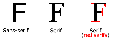
In CSS, we use the font-family property to specify the font of a text. The font-family property should hold several font names as a "fallback" system, to ensure maximum compatibility between browsers/operating systems. Start with the font you want, and end with a generic family (to let the browser pick a similar font in the generic family, if no other fonts are available). The font names should be separated with comma.
Web safe fonts are fonts that are universally installed across all browsers and devices. However, there are no 100% completely web safe fonts. There is always a chance that a font is not found or is not installed properly. Therefore, it is very important to always use fallback fonts.
Example:
.p2 {
font-family: Arial, Helvética, sans-serif;
}

.p3 {
font-family: "Lucida Console", "Courier New", monospace;
}
Most popular and ubiquitous fonts are:
- Arial (sans-serif)
- Verdana (sans-serif)
- Helvética (sans-serif)
- Tahoma (sans-serif)
- Trebuchet MS (sans-serif)
- Times New Roman (serif)
- Georgia (serif)
- Garamond (serif)
- Courier New (monospace)
- Brush Script MT (cursive)
The font-style property is mostly used to specify italic text. This property has three values:
normal - The text is shown normally
italic - The text is shown in italics
oblique - The text is "leaning" (oblique is very similar to italic, but less supported)
The font-weight property specifies the weight of a font: normal/bold
The font-variant property specifies whether or not a text should be displayed in a small-caps font. Ex: small-caps/ normal.
The font-size property sets the size of the text. To allow users to resize the text (in the browser menu), many developers use em instead of pixels. 1em is equal to the current font size. The default text size in browsers is 16px. So, the default size of 1em is 16px.
The text size can be set with a vw unit, which means the "viewport width". That way the text size will follow the size of the browser window:
Viewport is the browser window size. 1vw = 1% of viewport width. If the viewport is 50cm wide, 1vw is 0.5cm.
Google Fonts
If you do not want to use any of the standard fonts in HTML, you can use Google Fonts. Google Fonts are free to use, and have more than 1000 fonts to choose from. They provide an API for font-downloading which also includes customization and effects!
Note: Requesting multiple fonts may slow down your web pages! So be careful about that.
Usage example:
<head>
<link rel="stylesheet" href="https://fonts.googleapis.com/css?family=Sofia&effect=neon|outline|emboss|shadow-multiple">
<style>
body {
font-family: "Sofia", sans-serif;
font-size: 30px;
}
</style>
</head>
<body>

<h1 class="font-effect-neon">Neon Effect</h1>
<h1 class="font-effect-outline">Outline Effect</h1>
<h1 class="font-effect-emboss">Emboss Effect</h1>
<h1 class="font-effect-shadow-multiple">Multiple Shadow Effect</h1>

</body>
Font pairing is the act of combining fonts for different elements. Some fonts work well together.
All this font properties can be used with the shorthand font!!!
p.b {
font: italic small-caps bold 12px/30px Georgia, serif;
}
Web Fonts
Web fonts allow Web designers to use fonts that are not installed on the user's computer. When you have found/bought the font you wish to use, just include the font file on your web server, and it will be automatically downloaded to the user when needed. Your "own" fonts are defined within the CSS @font-face rule.
Different font descriptions such as bold or italics must be also added. Examples:
@font-face { font-family: myFirstFont; src: url(sansation_light.woff); } @font-face { font-family: myFirstFont; src: url(sansation_bold.woff); font-weight: bold; } div { font-family: myFirstFont; }
Other properties that can be defined in font-face are: font-stretch (condensed,normal,expanded,etc), unicode-range, etc.
Icons
Icons can be easily added using Google, Font Awesome, Bootstrap and many other services. Just include the import script and add < i> elements with class value the same as the icon name:
<!DOCTYPE html>
<html>
<head>
<link rel="stylesheet" href="https://maxcdn.bootstrapcdn.com/bootstrap/3.3.7/css/bootstrap.min.css">
</head>
<body>

<i class="glyphicon glyphicon-cloud"></i>
<i class="glyphicon glyphicon-remove"></i>
<i class="glyphicon glyphicon-user"></i>
<i class="glyphicon glyphicon-envelope"></i>
<i class="glyphicon glyphicon-thumbs-up"></i>

</body>
</html>
Links
Links can be styled differently depending on what state they are in.
The four links states are:
a:link - a normal, unvisited link
a:visited - a link the user has visited
a:hover - a link when the user mouses over it
a:active - a link the moment it is clicked
When setting the style for several link states, there are some order rules:
a:hover MUST come after a:link and a:visited
a:active MUST come after a:hover
Another interesting property is setting the cursor. With cursor: (auto|crosshair|default|help|wait|progress|text|...)
Lists
Define list item marker: list-style-type: (circle|square|upper-roman|lower-alpha) You can also define an image as the marker: list-style-image: url('resource.gif');
The list-style-type:none property can also be used to remove the markers/bullets. Note that the list also has default margin and padding. To remove this, add margin:0 and padding:0 to < ul> or < ol>. list is the shorthand property for all the later attributes.
A navigation bar is basically a list of links, so using the < ul> and < li> elements makes perfect sense. For an horizontal navbar you display list items (li) as blocks, for horizontal nav you can use an inline display with floats. A fixed position in navBars make the navigation bar stay at the top or the bottom of the page, even when the user scrolls the page. (sticky is also nice for horizontal navigation bars).
Note that Safari requires an special sticky:
ul {
position: -webkit-sticky; /* Safari */
position: sticky;
top: 0;
}
Tables
You can define the following properties:
table, th, td {
border: 1px solid black; //specifies borders
height: 70px; //Height of cells.
text-align: center; //Alignment
vertical-align: bottom; //Vertical alignment
padding: 15px; //space between border and content
}

table {
width: 100%; // If you need a table that should span the entire screen (full-width) set width 100%
border-collapse: collapse; //remove double borders
}

tr:nth-child(even) {background-color: #f2f2f2;} //zebra table!!

tr:hover {background-color: yellow;} //hoverable table
To make a responsive table:
<div style="overflow-x:auto;">

<table>
... table content ...
</table>

</div>
Display
The display property is the most important CSS property for controlling layout, it specifies if/how an element is displayed. Every HTML element has a default display value depending on what type of element it is. The default display value for most elements is block or inline.
display: none; is commonly used with JavaScript to hide and show elements without deleting and recreating them.
Hiding an element can be done by setting the display property to none. The element will be hidden, and the page will be displayed as if the element is not there: visibility:hidden; also hides an element. However, the element will still take up the same space as before. The element will be hidden, but still affect the layout:
h1.hidden {
visibility: hidden;
}
So we have the following properties:
display	        Specifies how an element should be displayed
visibility	    Specifies whether or not an element should be visible
Inline-block
Compared to display: inline, the major difference is that display: inline-block allows to set a width and height on the element. Also, with display: inline-block, the top and bottom margins/paddings are respected, but with display: inline they are not.
Compared to display: block, the major difference is that display: inline-block does not add a line-break after the element, so the element can sit next to other elements.
Dropdown
Dropdown content (pasarle el mouse al bloque y que aparezcan cosas debajo) es una aplicación del display:
<style>
.dropdown {
position: relative;
display: inline-block;
}

.dropdown-content {
display: none;
position: absolute;
background-color: #f9f9f9;
min-width: 160px;
box-shadow: 0px 8px 16px 0px rgba(0,0,0,0.2);
padding: 12px 16px;
z-index: 1;
}

.dropdown:hover .dropdown-content {
display: block;
}
</style>

<div class="dropdown">
<span>Mouse over me</span>
<div class="dropdown-content">
    <p>Hello World!</p>
</div>
</div>
Max-width
Setting the width of a block-level element will prevent it from stretching out to the edges of its container. Then, you can set the margins to auto, to horizontally center the element within its container. The element will take up the specified width, and the remaining space will be split equally between the two margins. The problem with the < div> above occurs when the browser window is smaller than the width of the element. The browser then adds a horizontal scrollbar to the page. Using max-width instead, in this situation, will improve the browser's handling of small windows. This is important when making a site usable on small devices
Position
The position property specifies the type of positioning method used for an element. There are five different position values:
- static (default)
- relative
- fixed
- absolute
- sticky
An element with position: static; is not positioned in any special way; it is always positioned according to the normal flow of the page.
An element with position: relative; is positioned relative to its normal position. Setting the top, right, bottom, and left properties of a relatively-positioned element will cause it to be adjusted away from its normal position. Other content will not be adjusted to fit into any gap left by the element:
div.relative {
position: relative;
left: 30px;
border: 3px solid #73AD21;
}
An element with position: fixed; is positioned relative to the viewport, which means it always stays in the same place even if the page is scrolled. The top, right, bottom, and left properties are used to position the element. A fixed element does not leave a gap in the page where it would normally have been located.
An element with position: absolute; is positioned relative to the nearest positioned ancestor (instead of positioned relative to the viewport, like fixed). However; if an absolute positioned element has no positioned ancestors, it uses the document body, and moves along with page scrolling. Note: Absolute positioned elements are removed from the normal flow, and can overlap elements.
An element with position: sticky; is positioned based on the user's scroll position. A sticky element toggles between relative and fixed, depending on the scroll position. It is positioned relative until a given offset position is met in the viewport - then it "sticks" in place (like position:fixed).
When elements are positioned, they can overlap other elements.
The z-index property specifies the stack order of an element (which element should be placed in front of, or behind, the others). An element can have a positive or negative stack order. An element with greater stack order is always in front of an element with a lower stack order:
img {
position: absolute;
left: 0px;
top: 0px;
z-index: -1;
}
Overflow
The overflow property specifies whether to clip the content or to add scrollbars when the content of an element is too big to fit in the specified area. The overflow property has the following values:
visible      - Default. The overflow is not clipped. The content renders outside the element's box
hidden       - The overflow is clipped, and the rest of the content will be invisible
scroll       - The overflow is clipped, and a scrollbar is added to see the rest of the content
auto         - Similar to scroll, but it adds scrollbars only when necessary
You can use overflow-x/y to customize overflow in each axis.
Float
The CSS float property specifies how an element should float. The CSS clear property specifies what elements can float beside the cleared element and on which side.
The float property is used for positioning and formatting content e.g. let an image float left to the text in a container.The float property can have one of the following values:
left     - The element floats to the left of its container
right    - The element floats to the right of its container
none     - The element does not float (will be displayed just where it occurs in the text). This is default
inherit  - The element inherits the float value of its parent
When we use the float property, and we want the next element below (not on right or left), we will have to use the clear property. The clear property specifies what should happen with the element that is next to a floating element. It can have one of the following values:
none     - The element is not pushed below left or right floated elements. This is default
left     - The element is pushed below left floated elements
right    - The element is pushed below right floated elements
both     - The element is pushed below both left and right floated elements
inherit  - The element inherits the clear value from its parent
When clearing floats, you should match the clear to the float: If an element is floated to the left, then you should clear to the left. Your floated element will continue to float, but the cleared element will appear below it on the web page.
To avoid overflow of containers using floating, we can use the following hack:
.clearfix::after {
content: "";
clear: both;
display: table;
}
The float tool is used a lot to create horizontal menus, side-by-side elements or entire web layouts.
Align
To horizontally center a block element (like < div>), use margin: auto; Setting the width of the element will prevent it from stretching out to the edges of its container. The element will then take up the specified width, and the remaining space will be split equally between the two margins:
To center an image, set left and right margin to auto and make it into a block element. Another way is using padding:
.center { padding: 70px 0; border: 3px solid green; text-align: center; }
Other alternatives include using transform and flexBox.
Combinators
A combinator is something that explains the relationship between the selectors.
There are four different combinators in CSS:
- descendant selector (space)
- child selector (>)
- adjacent sibling selector (+)
- general sibling selector (~)
Examples:
div p {         //selects all <p> elements inside <div> elements:
    background-color: yellow;
}

div > p {       //selects all <p> elements that are children of a <div> element
    background-color: yellow;
}

div + p {
    background-color: yellow; // sibling selector is used to select an element that is directly after another specific element. (Same parent, "immediately following")
}

div ~ p { selects all <p> elements that are next siblings of <div> elements. That is, all the <p> siblings that are AFTER a < div>
    background-color: yellow;
}
Pseudo-classes
A pseudo-class is used to define a special state of an element.
For example, it can be used to:
- Style an element when a user mouses over it
- Style visited and unvisited links differently
- Style an element when it gets focus
The syntax of pseudo-classes:
selector:pseudo-class {
property: value;
}
Examples of pseudoclasses are:
pseudoclass             example                 description
:active	                a:active	            Selects the active link
:checked	            input:checked	        Selects every checked <input> element
:disabled	            input:disabled	        Selects every disabled <input> element
:empty	                p:empty	                Selects every <p> element that has no children
:enabled	            input:enabled	        Selects every enabled <input> element
:first-child	        p:first-child	        Selects every <p> elements that is the first child of its parent
:first-of-type	        p:first-of-type	        Selects every <p> element that is the first <p> element of its parent
:focus	                input:focus	            Selects the <input> element that has focus
:hover	                a:hover	                Selects links on mouse over
:in-range	            input:in-range	        Selects <input> elements with a value within a specified range
:invalid	            input:invalid	        Selects all <input> elements with an invalid value
:lang(language)	        p:lang(it)	            Selects every <p> element with a lang attribute value starting with "it"
:last-child	            p:last-child	        Selects every <p> elements that is the last child of its parent
:last-of-type	        p:last-of-type	        Selects every <p> element that is the last <p> element of its parent
:link	                a:link	                Selects all unvisited links
:not(selector)	        :not(p)	                Selects every element that is not a <p> element
:nth-child(n)	        p:nth-child(2)	        Selects every <p> element that is the second child of its parent
:nth-last-child(n)  	p:nth-last-child(2)	    Selects every <p> element that is the second child of its parent, counting from the last child
:nth-last-of-type(n)	p:nth-last-of-type(2)	Selects every <p> element that is the second <p> element of its parent, counting from the last child
:nth-of-type(n)	        p:nth-of-type(2)	    Selects every <p> element that is the second <p> element of its parent
:only-of-type	        p:only-of-type	        Selects every <p> element that is the only <p> element of its parent
:only-child	            p:only-child	        Selects every <p> element that is the only child of its parent
:optional	            input:optional	        Selects <input> elements with no "required" attribute
:out-of-range	        input:out-of-range	    Selects <input> elements with a value outside a specified range
:read-only	            input:read-only	        Selects <input> elements with a "readonly" attribute specified
:read-write             input:read-write	    Selects <input> elements with no "readonly" attribute
:required	            input:required	        Selects <input> elements with a "required" attribute specified
:root	                root	                Selects the document's root element
:target	                #news:target	        Selects the current active #news element (clicked on a URL containing that anchor name)
:valid	                input:valid	            Selects all <input> elements with a valid value
:visited            	a:visited	            Selects all visited links
Pseudo-elements
A CSS pseudo-element is used to style specified parts of an element. For example, it can be used to:
- Style the first letter, or line, of an element
- Insert content before, or after, the content of an element
Syntax:
selector::pseudo-element {
property: value;
}
Some examples:
::after	        p::after	    Insert content after every <p> element
::before	    p::before	    Insert content before every <p> element
::first-letter	p::first-letter	Selects the first letter of every <p> element
::first-line	p::first-line	Selects the first line of every <p> element
::selection	    p::selection	Selects the portion of an element that is selected by a user
::marker        ::marker        Selects the markers of list items.
Attribute Selector
The [ attribute] selector is used to select elements with a specified attribute. The following example selects all < a> elements with a target attribute. There are many variations of selectors that are used to match different attributes or even clases:
a[target] { //selects all <a> elements with a target attribute
background-color: yellow;
}

a[target="_blank"] //selects all <a> elements with a target="_blank" attribute:
background-color: yellow;
}

[title~="flower"] { //Selects all elements with a title attribute that contains a space-separated list of words, one of which is "flower":
border: 5px solid yellow;
}

[class|="top"] { //Selects all elements with a class attribute value that begins with "top"
background: yellow;
}
Note: The value has to be a whole word, either alone, like class="top", or followed by a hyphen( - ), like class="top-text"! The following selector is an alternative if you want an alternative behaviour:
The [ attribute^="value"] selector is used to select elements whose attribute value begins with a specified value. The following example selects all elements with a class attribute value that begins with "top":
[class^="top"] {
background: yellow;
}

[class$="test"] { //selects all elements with a class attribute value that ends with "test"
background: yellow;
}

[class*="te"] { //selects all elements with a class attribute value that contains "te":
    background: yellow;
}
An application of this is used to style different type= of inputs (button, text, etc.)
Counters
CSS counters are like "variables". The variable values can be incremented by CSS rules (which will track how many times they are used). To work with CSS counters we will use the following properties:
content	            Used with the ::before and ::after pseudo-elements, to insert generated content
counter-increment	Increments one or more counter values
counter-reset	    Creates or resets one or more counters
counter()	        Returns the current value of the named counter
Example:
ol {
counter-reset: section;
list-style-type: none;
}

li::before {
counter-increment: section;
content: counters(section,".") " ";
}
Units
CSS has several different units for expressing a length. Many CSS properties take "length" values, such as width, margin, padding, font-size, etc. Length is a number followed by a length unit, such as 10px, 2em, etc.
Hay 2 tipos, absolute y relative units:
Absolute:
cm	    centimetres
mm	    millimetres
in	    inches (1in = 96px = 2.54cm)
px *	pixels (1px = 1/96th of 1in)
pt	    points (1pt = 1/72 of 1in)
pc	    picas (1pc = 12 pt)
Relative:
em	    Relative to the font-size of the element (2em means 2 times the size of the current font)
ex	    Relative to the x-height of the current font (rarely used)
ch	    Relative to width of the "0" (zero)
rem	    Relative to font-size of the root element
vw	    Relative to 1% of the width of the viewport*
vh	    Relative to 1% of the height of the viewport*
VMin	Relative to 1% of viewport's* smaller dimension
VMax	Relative to 1% of viewport's* larger dimension
%	    Relative to the parent element
Specificity
Specificity is a common reason why your CSS-rules don't apply to some elements, although you think they should.
In general, the following hierarchy follows: (there is a weird sum add game but i will omit it)
- Inline styles - An inline style is attached directly to the element to be styled. Example: < h1 style="color: #ffffff;">.
- IDs - An ID is a unique identifier for the page elements, such as #navbar.
- Classes, attributes and pseudo-classes - This category includes .classes, [ attributes] and pseudo-classes such as :hover, :focus etc.
- Elements and pseudo-elements - This category includes element names and pseudo-elements, such as h1, div, :before and :after.
he !important rule in CSS is used to add more importance to a property/value than normal. In fact, if you use the !important rule, it will override ALL previous styling rules for that specific property on that element!
The only way to override an !important rule is to include another !important rule on a declaration with the same (or higher) specificity in the source code - and here the problem starts! This makes the CSS code confusing and the debugging will be hard, especially if you have a large style sheet!
Transforms
2D
CSS transforms allow you to move, rotate, scale, and skew elements. CSS supports the following transformations:
translate(x,y)          //moves an element from its current position (according to the parameters given for the X-axis and the Y-axis).
rotate(-20deg)          //rotates an element clockwise or counter-clockwise according to a given degree.
scale(width,height)     //increases or decreases the size of an element (according to the parameters given for the width and height). Also: scaleX(),scaleY().
skew(deg,deg)           //skews an element along the X and Y-axis by the given angles (paralelogramo). Also: skewX(), skewY()
matrix(scaleX(),skewY(),skewX(),scaleY(),translateX(),translateY())    //Todo en uno!!!
3D
CSS also supports 3D transformations.
transform: rotateZ(90deg); //rotates an element around its Z-axis at a given degree:
translateZ(z) //Defines a 3D translation, using only the value for the Z-axis
rotate3d(x,y,z,angle) //Defines a 3D rotation
Transitions
CSS transitions allows you to change property values smoothly, over a given duration. To create a transition effect, you must specify two things:
- the CSS property you want to add an effect to
- the duration of the effect
When a property changes, there is now a transition effect!!! Example:
div {
transition: width 2s, height 4s, transform 3s; //you can also specify transformations!
transition-timing-function: ease-out; //specifies the speed curve of the transition. ease-out makes the effect to have an slow end.
transition-delay: 1s; //delays the transition
}
Animations
An animation lets an element gradually change from one style to another. You can change as many CSS properties you want, as many times as you want. To use CSS animation, you must first specify some keyframes for the animation. Keyframes hold what styles the element will have at certain times.
When you specify CSS styles inside the @keyframes rule, the animation will gradually change from the current style to the new style at certain times. To get an animation to work, you must bind the animation to an element. For example:
/* The animation code */
@keyframes example {
from {background-color: red;} //start (0% complete)
to {background-color: yellow;} //end (100% complete)
}

/* The element to apply the animation to */
div {
width: 100px;
height: 100px;
background-color: red;
animation-name: example; //binds the animation
animation-duration: 4s; //sets its duration
animation-delay: 2s //sets a delay to start the animation.
animation-iteration-count: infinite; //sets the animation to loop indefinitely
animation-direction: reverse; //hoe to play the animation. (normal (default),reverse,alternate (forwards first, then backward),alternate-reverse)
animation-timing-function: cubic-Bezier(n,n,n,n) //speed curve of the animation
}
Another way of defining a keyframe is by indicating its percentage:
/* The animation code */
@keyframes example {
0%   {background-color: red;}
25%  {background-color: yellow;}
50%  {background-color: blue;}
100% {background-color: green;}
}
CSS animations do not affect an element before the first keyframe is played or after the last keyframe is played. The animation-fill-mode property can override this behaviour. The animation-fill-mode property specifies a style for the target element when the animation is not playing (before it starts, after it ends, or both):
none -          Default value. Animation will not apply any styles to the element before or after it is executing
forwards -      The element will retain the style values that is set by the last keyframe (depends on animation-direction and animation-iteration-count)
backwards -     The element will get the style values that is set by the first keyframe (depends on animation-direction), and retain this during the animation-delay period
both -          The animation will follow the rules for both forwards and backwards, extending the animation properties in both directions
Tooltips
Tooltips are an implementation of hovering action often used to specify extra information about something when the user moves the mouse pointer over an element. The following is a basic tootlip:
<style>
/* Tooltip container */
.tooltip {
position: relative;
display: inline-block;
border-bottom: 1px dotted black; /* If you want dots under the hoverable text */
}

/* Tooltip text */
.tooltip .tooltiptext {
visibility: hidden;
width: 120px;
background-color: black;
color: #fff;
text-align: center;
padding: 5px 0;
border-radius: 6px;

/* Position the tooltip text - see examples below! */
position: absolute;
z-index: 1;
}

/* Show the tooltip text when you mouse over the tooltip container */
.tooltip:hover .tooltiptext {
visibility: visible;
}
</style>

<div class="tooltip">Hover over me
<span class="tooltiptext">Tooltip text</span>
</div>
Object-fit/position
The CSS object-fit property is used to specify how an < img> or < video> should be resized to fit its container. This property tells the content to fill the container in a variety of ways; such as "preserve that aspect ratio" or "stretch up and take up as much space as possible".
The object-fit property can take one of the following values:
fill        - This is default. The image is resized to fill the given dimension. If necessary, the image will be stretched or squished to fit
contain     - The image keeps its aspect ratio, but is resized to fit within the given dimension
cover       - The image keeps its aspect ratio and fills the given dimension. The image will be clipped to fit
none        - The image is not resized
scale-down  - the image is scaled down to the smallest version of none or contain
The CSS object-position property is used to specify how an < img> or < video> should be positioned within its container. Example:
img {
width: 200px;
height: 300px;
object-fit: cover;
object-position: 80% 100%;
}
We can use this to show an specific part of an image when all the image doesn't fin in the container.
Multiple Columns
The column-count property specifies the number of columns an element should be divided into. Example:
div {
column-count: 3;
column-gap: 40px; //specifies space between columns.
column-rule-style: solid; //specifies the style of the rule between columns
column-rule-width: 1px; //especifica el grosor del borde que separa las columnas
column-rule-color: lightblue; //especifica el color...
 column-width: 100px; //specifies a suggested, optimal width for the columns.
}
The column-span property specifies how many columns an element should span across. he following example specifies that the < h2> element should span across all columns:
h2 {
column-span: all;
}
Resizing
The resize property specifies if (and how) an element should be resizable by the user. Example:
div {
resize: horizontal; //specifies how can it be resized (values= both,vertical,none(default))
overflow: auto;
}
Variables
The var() function is used to insert the value of a CSS variable. CSS variables have access to the DOM, which means that you can create variables with local or global scope, change the variables with JavaScript, and change the variables based on media queries. A good way to use CSS variables is when it comes to the colors of your design. Instead of copy and paste the same colors over and over again, you can place them in variables.
The syntax of the var() function is as follows:
var(--name, value)
Where:
name	Required. The variable name (must start with two dashes)
value	Optional. The fallback value (used if the variable is not found)
CSS variables can have a global or local scope. Global variables can be accessed/used through the entire document, while local variables can be used only inside the selector where it is declared. To create a variable with global scope, declare it inside the :root selector. The :root selector matches the document's root element. To create a variable with local scope, declare it inside the selector that is going to use it.
This is an example of how to change a CSS Variable with JavaScript:
<script>
// Get the root element
var r = document.querySelector(':root');

// Create a function for getting a variable value
function myFunction_get() {
// Get the styles (properties and values) for the root
var rs = getComputedStyle(r);
// Alert the value of the --blue variable
alert("The value of --blue is: " + rs.getPropertyValue('--blue'));
}

// Create a function for setting a variable value
function myFunction_set() {
// Set the value of variable --blue to another value (in this case "lightblue")
r.style.setProperty('--blue', 'lightblue');
}
</script>
Variables can also be edited by @media queries. For example, we create a @media rule that says "When the browser's width is 450px or wider, change the --fontsize variable value of the .container class to 50px."
/* Variable declarations */
:root {
--blue: #1e90ff;
--white: #ffffff;
}

.container {
--fontsize: 25px;
}

/* Styles */
body {
background-color: var(--blue);
}

@media screen and (min-width: 450px) {
    .container {
        --fontsize: 50px;
    }
}
Box-sizing
The box-sizing property allows us to include the padding and border in an element's total width and height. If you set box-sizing: border-box; on an element, padding and border are included in the width and height. The traditional heigh and width of a document is calculated by width + padding + border = actual width of an element and height + padding + border = actual height of an element.
Since the result of using the box-sizing: border-box; is so much better, many developers want all elements on their pages to work this way. This can be set globally by:
* {
box-sizing: border-box;
}
Media queries
Media queries can be used to check many things, such as:
- width and height of the viewport
- width and height of the device
- orientation (is the tablet/phone in landscape or portrait mode?)
- resolution
This way, we can add responsiveness to a website. A media query consists of a media type and can contain one or more expressions, which resolve to either true or false:
@media not|only mediatype and (expressions) {
CSS-Code;
}
A mediatype can be:
all	    Used for all media type devices
print	Used for printers
screen	Used for computer screens, tablets, smart-phones etc.
speech	Used for screenreaders that "reads" the page out loud
A classic use is for horizontal-menus only on small screens:
/* The navbar container */
.topnav {
overflow: hidden;
background-color: #333;
}

/* Navbar links */
.topnav a {
float: left;
display: block;
color: white;
text-align: center;
padding: 14px 16px;
text-decoration: none;
}

/* On screens that are 600px wide or less, make the menu links stack on top of each other instead of next to each other */
@media screen and (max-width: 600px) {
.topnav a {
    float: none;
    width: 100%;
}
}
Media rules can be more complex, using logical and and or:
/* When the width is between 600px and 900px OR above 1100px - change the appearance of <div> */
@media screen and (max-width: 900px) and (min-width: 600px), (min-width: 1100px) {
    ...
}
It is also used to hide elements, change font sizes, change size of columns and their count, etc.
Flexbox
The Flexible Box Layout Module, makes it easier to design flexible responsive layout structure without using float or positioning. A flex container becomes flexible by setting the display property to flex:
.flex-container {
display: flex;
}
This enables the following properties:
flex-direction //defines in which direction the container wants to stack the flex items. (eg column,row)
flex-wrap // specifies whether the flex items should wrap or not (wrap,nowrap).
flex-flow //shorthand property for setting both the flex-direction and flex-wrap properties.
justify-content //used to align the flex items: (center,flex-start,flex-end,space-around/between)
align-items //used to align the flex items (center,flex-start,flex-end,baseline).
align-content //used to align the flex lines (space-between, stretch, center,flex-start.,etc).
A perfect centering can be obtained by:
.flex-container {
display: flex;
height: 300px;
justify-content: center;
align-items: center;
}
The direct child elements of a flex container automatically becomes flexible (flex) items. The flex item properties are:
order //specifies the order of the flex items. (The first flex item in the code does not have to appear as the first item in the layout. The order value must be a number, default value is 0.)
flex-grow //specifies how much a flex item will grow relative to the rest of the flex items.
flex-shrink  //oposite to flex-grow
flex-basis //specifies the initial length of a flex item.
flex //shorthand property for the flex-grow, flex-shrink, and flex-basis properties.
align-self // overrides the default alignment set by the container's align-items property.
Responsive Web Design (RWD)
Responsive web design makes your web page look good on all devices using only HTML and CSS, i.e it is not a program nor a JavaScript. It is called responsive web design when you use CSS and HTML to resize, hide, shrink, enlarge, or move the content to make it look good on any screen.
Viewport
The viewport is the user's visible area of a web page. It needs to be loaded via html:
<meta name="viewport" content="width=device-width, initial-scale=1.0">
Users are used to scroll websites vertically on both desktop and mobile devices - but not horizontally! So, if the user is forced to scroll horizontally, or zoom out, to see the whole web page it results in a poor user experience. To avoid this:
- Do NOT use large fixed width elements
- Do NOT let the content rely on a particular viewport width to render well
- Use CSS media queries to apply different styling for small and large screens
Gridview
Many web pages are based on a grid-view, which means that the page is divided into columns. Using a grid-view is very helpful when designing web pages. It makes it easier to place elements on the page.
To make a responsive gridview you need all elements with box-sizing. Then define the width of each col (usually 12):
.col-1 {width: 8.33%;}
.col-2 {width: 16.66%;}
.col-3 {width: 25%;}
.col-4 {width: 33.33%;}
.col-5 {width: 41.66%;}
.col-6 {width: 50%;}
.col-7 {width: 58.33%;}
.col-8 {width: 66.66%;}
.col-9 {width: 75%;}
.col-10 {width: 83.33%;}
.col-11 {width: 91.66%;}
.col-12 {width: 100%;}

[class*="col-"] { // All these columns should be floating to the left, and have a padding of 15px:
    float: left;
    padding: 15px;
    border: 1px solid red;
}

<div class="row"> //Each row should be wrapped in a <div>. The number of columns inside a row should always add up to 12:
    <div class="col-3">...</div> <!-- 25% -->
    <div class="col-9">...</div> <!-- 75% -->
</div>

.row::after {//The columns inside a row are all floating to the left, and are therefore taken out of the flow of the page, and other elements will be placed as if the      columns do not exist. To prevent this, we will add a style that clears the flow:
    content: "";
    clear: both;
    display: table;
}
Media Queries
We can use this rule to make all the columns take 100% width, which is great on mobile:
@media only screen and (max-width: 768px) {
/* For mobile phones: */
[class*="col-"] {
    width: 100%;
}
}
There are tons of screens and devices with different heights and widths, so it is hard to create an exact breakpoint for each device. To keep things simple you could target five groups:
/* Extra small devices (phones, 600px and down) */
@media only screen and (max-width: 600px) {...}

/* Small devices (portrait tablets and large phones, 600px and up) */
@media only screen and (min-width: 600px) {...}

/* Medium devices (landscape tablets, 768px and up) */
@media only screen and (min-width: 768px) {...}

/* Large devices (laptops/desktops, 992px and up) */
@media only screen and (min-width: 992px) {...}

/* Extra large devices (large laptops and desktops, 1200px and up) */
@media only screen and (min-width: 1200px) {...}
Media queries can also be used to change layout of a page depending on the orientation of the browser. You can have a set of CSS properties that will only apply when the browser window is wider than its height, a so called "Landscape" orientation:
@media only screen and (orientation: landscape) {
body {
    background-color: lightblue;
}
}
Mobile First
Mobile First means designing for mobile before designing for desktop or any other device (This will make the page display faster on smaller devices). Instead of changing styles when the width gets smaller than X, we should change the design when the width gets larger than X. This will make our design Mobile First.
According to the previous examples:
/* For mobile phones: */
[class*="col-"] {
width: 100%;
}

@media only screen and (min-width: 768px) {
/* For desktop: */
.col-1 {width: 8.33%;}
.col-2 {width: 16.66%;}
.col-3 {width: 25%;}
.col-4 {width: 33.33%;}
.col-5 {width: 41.66%;}
.col-6 {width: 50%;}
.col-7 {width: 58.33%;}
.col-8 {width: 66.66%;}
.col-9 {width: 75%;}
.col-10 {width: 83.33%;}
.col-11 {width: 91.66%;}
.col-12 {width: 100%;}
}
Images
If the width property is set to a percentage and the height property is set to "auto", the image will be responsive and scale up and down. If the max-width property is set to 100%, the image will scale down if it has to, but never scale up to be larger than its original size. Something analog can also be done to background images.
A common pattern is to change an image depending on the viewport:
body {
background-image: url('img_smallflower.jpg');
}

/* For width 400px and larger: */
@media only screen and (min-width: 400px) {
body {
    background-image: url('img_flowers.jpg');
}
}
You can also use HTML elements for this kinds of things like < picture> , < video>, and < audio> which can have responsive attributes.
Grid
The CSS Grid Layout Module offers a grid-based layout system, with rows and columns, making it easier to design web pages without having to use floats and positioning. A grid layout consists of a parent element, with one or more child elements:
<div class="grid-container">
<div class="grid-item">1</div>
<div class="grid-item">2</div>
<div class="grid-item">3</div>
<div class="grid-item">4</div>
<div class="grid-item">5</div>
<div class="grid-item">6</div>
<div class="grid-item">7</div>
<div class="grid-item">8</div>
<div class="grid-item">9</div>
</div>
An HTML element becomes a grid container when its display property is set to grid or inline-grid:
.grid-container { display: grid; //inline-grid grid-gap: 50px 100px; //shorthand property for the grid-row-gap and the grid-column-gap properties (gap between the rows/columns) }
You can choose where items belong by saying in which line starts and ends:
.item1 { grid-column-start: 1; grid-column-end: 3; grid-row-start: 1; grid-row-end: 4; //This can be shorthanded with grid-row and gird-column }
Alternatively:
.item1 { grid-area: 1 / 1 / 3 / 4; }
The grid-template-columns property defines the number of columns in your grid layout, and it can define the width of each column. The value is a space-separated-list, where each value defines the width of the respective column. If you want your grid layout to contain 4 columns, specify the width of the 4 columns, or "auto" if all columns should have the same width:
.grid-container {
    display: grid;
    grid-template-columns: auto auto auto auto;
    grid-template-rows: 80px 200px 100px 20cm; //defines the height of each row.
    justify-content: space-around; //align the whole grid inside the container.
    align-content: used to vertically align the whole grid inside the container.
}
Sass
Sass is a CSS pre-processor. It was supposedly made to reduce repetition of properties thus saving time. It stands for Syntactically Awesome Stylesheet. It is clearly a waste of time :).
W3S JavaScript Tutorial
Scripts can be imported to a webpage by:
<script src="myScript.js"></script>
Placing scripts at the bottom of the < body> element improves the display speed, because script interpretation slows down the display.
Output
JavaScript can "display" data in different ways:
- Writing into an HTML element, using innerHTML.
- Writing into the HTML output using document.write().
- Writing into an alert box, using window.alert().
- Writing into the browser console, using console.log().
To access an HTML element, JavaScript can use the document.getElementById(id) method. And then accessing its inner html content. Using document.write() after an HTML document is loaded, will delete all existing HTML, thus document.write() should only be used for testing.
You can use an alert box to display data:
window.alert(5 + 6);
In JavaScript, the window object is the global scope object, that means that variables, properties, and methods by default belong to the window object. This also means that specifying the window keyword is optional. So its equivalent to alert(5+6);
For debugging purposes, you can call the console.log() method in the browser to display data: console.log(5+6);
There is no "print" in JavaScript. The only thing that comes near is the window.print(), which makes the browser literally print the content of the current window.
Syntax
Variables in javascript are declared by: let a,b,c;. A function example syntax is:
function myFunction() {
    document.getElementById("demo1").innerHTML = "Hello Dolly!";
    document.getElementById("demo2").innerHTML = "How are you?";
}
JavaScript uses the keywords var, let and const to declare variables.
Double slashes and /* */ are comments. In variables, the first character must be a letter, or an underscore (_), or a dollar sign ($).Subsequent characters may be letters, digits, underscores, or dollar signs. All identifiers are case sensitive. JavaScript uses the Unicode character set.
Variables
The let keyword was introduced in ES6 (2015). Variables defined with let cannot be Redeclared, must be Declared before use and have Block Scope. However, redeclaring a variable with let, in another block, IS allowed:
let x = 2;    // Allowed

{
let x = 3;    // Allowed
}

{
let x = 4;    // Allowed
}
Variables declared with the var keyword can NOT have block scope. Redeclaring a JavaScript variable with var is allowed anywhere in a program.
Variables defined with var are hoisted to the top and can be initialized at any time. Variables defined with let are also hoisted to the top of the block, but not initialized. This means that you can use a VAR variable before declaring it but not a LET variable.
carName = "Volvo"; //OK
var carName;

carName = "Saab"; //WRONG
let carName = "Volvo";
The const keyword was introduced in ES6 (2015). Variables defined with const cannot be Redeclared nor reassigned and have block scope. It does not define a constant value. It defines a constant reference to a value.
Operators
Binary and Unary:
+	Addition
-	Subtraction
*	Multiplication
**	Exponentiation (ES2016)
/	Division
%	Modulus (Division Remainder)
++	Increment
--	Decrement
Assignment:
=	x = y	x = y
+=	x += y	x = x + y
-=	x -= y	x = x - y
*=	x *= y	x = x * y
/=	x /= y	x = x / y
%=	x %= y	x = x % y
**=	x **= y	x = x ** y
Comparisons:
==	equal to
===	equal value and equal type
!=	not equal
!==	not equal value or not equal type
>	greater than
<	less than
>=	greater than or equal to
<=	less than or equal to
?	ternary operator
Logical:
&&	logical and
||	logical or
!	logical not
Types:
typeof	    Returns the type of a variable
instanceof	Returns true if an object is an instance of an object type
Types
JavaScript has dynamic types... NI-
In JavaScript there are 5 different data types that can contain values:
- string
- number
- boolean
- object
- function
There are 6 types of objects:
- Object
- Date
- Array
- String
- Number
- Boolean
And 2 data types that cannot contain values:
- null
- undefined
In JavaScript null is "nothing". It is supposed to be something that doesn't exist. In JavaScript, the data type of null is an object. You can empty an object by setting it to null.
Extra large or extra small numbers can be written with scientific (exponential) notation:
let y = 123e5;      // 12300000
let z = 123e-5;     // 0.00123
When adding a number and a string, JavaScript will treat the number as a string.
JavaScript arrays are written with square brackets. Array items are separated by commas and start at 0 and can be indexed with [] operator. Arrays can be built dynamically or with object notation, however the fist one is better in execution speed:
const cars = [];
cars[0]= "Saab";
cars[1]= "Volvo";
cars[2]= "BMW";
const cars = new Array("Saab", "Volvo", "BMW");
JavaScript variables can be objects. Arrays are special kinds of objects. Because of this, you can have variables of different types in the same Array. You can have objects in an Array. You can have functions in an Array. You can have arrays in an Array. Look at this cool loop: fruits.forEach(printFruit());
WARNING ! Adding elements with high indexes can create undefined "holes" in an array
Arrays also have methods, like toString(),pop(),push(),sort() and more! Arrays can be built by declaring a map:
const numbers1 = [45, 4, 9, 16, 25];
const numbers2 = numbers1.map(myFunction); //other ones are: filter/reduce/every/some/includes/find/etc.

function myFunction(value, index, array) {
return value * 2;
}
JavaScript objects are written with curly braces {}. Object properties are written as name:value pairs, separated by commas:
const person = {firstName:"John", lastName:"Doe", age:50, eyeColor:"blue"};
It is a common practice to declare objects with the const keyword.
Any variable can be emptied, by setting the value to undefined. The type will also be undefined:
car = undefined; // Value is undefined, type is undefined
JavaScript Numbers are Always 64-bit Floating Point, following the international IEEE 754 standard.
NaN is a JavaScript reserved word indicating that a number is not a legal number. Trying to do arithmetic with a non-numeric string will result in NaN (Not a Number). Infinity (or -Infinity) is the value JavaScript will return if you calculate a number outside the largest possible number.
Date objects are created with the new Date() constructor:
new Date() //current date and time:
new Date(year, month, day, hours, minutes, seconds, milliseconds)
new Date(milliseconds)
new Date(date string)
JavaScript stores dates as number of milliseconds since January 01, 1970, 00:00:00 UTC (Universal Time Coordinated). There are generally 3 types of JavaScript date input formats:
ISO Date	"2015-03-25" (The International Standard)
Short Date	"03/25/2015"
Long Date	"Mar 25 2015" or "25 Mar 2015"
The constructor also accepts this ISO format. And you can choose these formats in the output. Date is an objects, so it has its getter and setters.
In some browsers, months or days with no leading zeroes may produce an error.
Functions
function name(parameter1, parameter2, parameter3) {
    // code to be executed
    return X;
}
Objects
In JavaScript, almost "everything" is an object.
- Booleans can be objects (if defined with the new keyword)
- Numbers can be objects (if defined with the new keyword)
- Strings can be objects (if defined with the new keyword)
- Dates are always objects
- Maths are always objects
- Regular expressions are always objects
- Arrays are always objects
- Functions are always objects
- Objects are always objects
- All JavaScript values, except primitives, are objects.
There are different ways to create new objects:
- Create a single object, using an object literal. Example: const person = {firstName:"John", lastName:"Doe", age:50, eyeColor:"blue"};
- Create a single object, with the keyword new. Example: const person = new Object(); person.firstName = "John"; person.lastName = "Doe";
- Define an object constructor, and then create objects of the constructed type.
- Create an object using Object.create().
Objects are mutable: They are addressed by reference, not by value. const x = y makes a new reference for what y points. You can access object properties in three ways:
objectName.propertyName
objectName["propertyName"]
objectName[expression]   // x = "age"; person[x]
A method is a function stored as a property.
const person = {
    firstName: "John",
    lastName : "Doe",
    id       : 5566,
    fullName : function() {
        return this.firstName + " " + this.lastName;
    }
};
this refers to the implicit object. Methods are executed with objectName.methodName();
When a JavaScript variable is declared with the keyword "new", the variable is created as an object.
Despite numbers can also be defined as objects with the keyword new, it is not recommended at all. Even more, strings and numbers HAVE methods, so you can just use them without a worry:
(100 + 23).toString();
You can add new properties to an existing object by simply giving it a value: x.newProp = "lol"'; The delete keyword deletes a property from an object: delete x.newProp;
Objects can also be nested. So if you have:
myObj = {
name:"John",
cars: {
    car1:"Ford",

}
}
You can do: myObj.cars.car1 and you will get "Ford".
There are many strategies for displaying objects:
- Displaying the Object Properties by name
- Displaying the Object Properties in a Loop
- Displaying the Object using Object.values()
- Displaying the Object using JSON.stringify()
Getters & Setters
Getters and setters have an special syntax:
const person = {
firstName: "John",
lastName: "Doe",
language: "",
set lang(lang) {
    this.language = lang;
}
get lang() {
    return this.language;
}
};
// Set an object property using a setter:
person.lang = "en";
// Display data from the object using a getter:
document.getElementById("demo").innerHTML = person.lang;
Events
HTML events are "things" that happen to HTML elements. When JavaScript is used in HTML pages, JavaScript can "react" on these events. Examples:
- An HTML web page has finished loading
- An HTML input field was changed
- An HTML button was clicked
Event structure:
<element event="some JavaScript">
<button onclick="displayDate()">The time is?</button>
Some common HTML events are:
onchange	An HTML element has been changed
onclick	    The user clicks an HTML element
onmouseover	The user moves the mouse over an HTML element
onmouseout	The user moves the mouse away from an HTML element
onkeydown	The user pushes a keyboard key
onload	    The browser has finished loading the page
Template literals
Template Literals use back-ticks (``) rather than the quotes ("") to define a string:
let text = `Hello World!`;
This can be used to perform different string substitution techniques and multiline strings:
let text =
    `The quick
    brown fox
    jumps over
    the lazy dog`;
let firstName = "John";
let lastName = "Doe";
let text = `Welcome ${firstName}, ${lastName}!`;
let price = 10;
let VAT = 0.25;
let total = `Total: ${(price * (1 + VAT)).toFixed(2)}`;
Programming constructs
In JavaScript we have the following conditional statements: if,else,else if and switch. Examples:
if (condition) {
//  block of code to be executed if the condition is true
}
switch(expression) {
case x:
    // code block
    break;
case y:
    // code block
    break;
default:
    // code block
}
JS has the following loops: for, for in, for of, while, do/while. Examples:
for (statement 1 (let i=0); statement 2; statement 3) { //Classic C style iteration.
    // code block to be executed
}
for (key in object) { //loops through the properties of an Object. Ie for (key in Array) makes key to be the numbers to access the array.
    // code block to be executed
}
for (variable of iterable) { //loops through the values of an iterable object. Ie for (x of Array) iterate over the VALUES of the array.
    // code block to be executed
}
while (condition) {
    // code block to be executed
}
do {
    // code block to be executed
    break; //Classic break.
    continue; //lol

} while (condition);
You can also make labels:
and have a break label or continue label to return to the named label`
Javascript also has the try/catch/throw and finally error handlers.
Javascript also has a strict mode that helps you write cleaner code. You have to write "use strict"; at the beginning of the script or function.
Iterables & Datatypes
Iterables are iterable objects (like Arrays). Iterables can be accessed with simple and efficient code. Arrays,strings, and abstract data types are iterables. Some examples:
const name = "W3Schools";

for (const x of name) {
    // code block to be executed
}

const letters = new Set(["a","b","c"]);
const fruits = new Map([
    ["apples", 500],
    ["bananas", 300],
    ["oranges", 200]
]);
A JavaScript Set is a collection of unique values. Each value can only occur once in a Set:
new Set()	Creates a new Set
add()	    Adds a new element to the Set
delete()	Removes an element from a Set
has()	    Returns true if a value exists in the Set
forEach()	Invokes a callback for each element in the Set
values()	Returns an iterator with all the values in a Set
size	    Returns the number elements in a Set
A Map holds key-value pairs where the keys can be any datatype. A Map remembers the original insertion order of the keys:
new Map() Creates a new Map set() Sets the value for a key in a Map get() Gets the value for a key in a Map delete() Removes a Map element specified by the key has() Returns true if a key exists in a Map forEach() Calls a function for each key/value pair in a Map entries() Returns an iterator with the [key, value] pairs in a Map size Returns the number of elements in Map
Classes
Use the keyword class to create a class and always add a method named constructor():
class ClassName {
    constructor() { ... }
}
To create a class inheritance, use the extends keyword. A class created with a class inheritance inherits all the methods from another class. By calling the super() method in the constructor method, we call the parent's constructor method and gets access to the parent's properties and methods. Classes must be declared before using them.
class Model extends Car {
    constructor(brand, mod) {
        super(brand);
        this.model = mod;
    }
    show() {
        return this.present() + ', it is a ' + this.model;
    }
}
Static class methods are defined on the class itself. You cannot call a static method on an object, only on an object class.
JSON
JSON is a format for storing and transporting data. JSON is often used when data is sent from a server to a web page. It stands for JavaScript Object Notation. It's a lightweight data interchange format and is readable to humans.
Rules:
- Data is in name/value pairs
- Data is separated by commas
- Curly braces hold objects
- Square brackets hold arrays
The JSON format is syntactically identical to the code for creating JavaScript objects.:
{
"employees":[
{"firstName":"John", "lastName":"Doe"},
{"firstName":"Anna", "lastName":"Smith"},
{"firstName":"Peter", "lastName":"Jones"}
]
}
Use the JavaScript built-in function JSON.parse() to convert the string into a JavaScript object:
const obj = JSON.parse(text);
To transform an object into a JSON:
const obj = {name: "John", age: 30, city: "New York"};
const myJSON = JSON.stringify(obj);
Passing functions as JSON must be avoided or used with caution, because it requires en eval(). If you send functions using JSON, the functions will lose their scope, and the receiver would have to use eval() to convert them back into functions.
Example of receiving a list with JSON and AJAX:
const dbParam = JSON.stringify({table:"customers",limit:20});
const xmlhttp = new XMLHttpRequest();
xmlhttp.onload = function() {
const myObj = JSON.parse(this.responseText);
let text = "<select>"
for (let x in myObj) {
    text += "<option>" + myObj[x].name;
}
text += "</select>"
document.getElementById("demo").innerHTML = text;
}
}
xmlhttp.open("POST", "json_demo_html_table.php", true);
xmlhttp.setRequestHeader("Content-type", "application/x-www-form-urlencoded");
xmlhttp.send("x=" + dbParam);
## Debugging
We have the console.log() que está clave. Breakpoints en los debuggers.
Functions
Function declarations are hoisted. So you can declare it in any part of the script without worries. Functions can be thought as objects:
const myFunction = function (a, b) {return a * b};
Function expressions will execute automatically if the expression is followed by ():
(function () {
let x = "Hello!!";  // I will invoke myself
})();
This is an example of an anonymous self-invoking function.
Arrow functions allows a short syntax for writing function expressions. You don't need the function keyword, the return keyword, and the curly brackets:
const x = (x, y) => x * y;
JavaScript function definitions do not specify data types for parameters, functions do not perform type checking on the passed arguments and do not check the number of arguments received.
If a function is called with missing arguments (less than declared), the missing values are set to undefined.
JavaScript functions have a built-in object called the arguments object. The argument object contains an array of the arguments used when the function was called (invoked). Example:
x = findMax(1, 123, 500, 115, 44, 88);

function findMax() {
let max = -Infinity;
for (let i = 0; i < arguments.length; i++) {
    if (arguments[i] > max) {
    max = arguments[i];
    }
}
return max;
}
If a function is called with too many arguments (more than declared), these arguments can be reached using the arguments object.
Arguments are passed by value and objects are passed by REFERENCE
The call() method is a predefined JavaScript method. It can be used to invoke (call) a method with an owner object as an argument (parameter). With call(), an object can use a method belonging to another object.
With the apply() method, you can write a method that can be used on different objects. The apply() method takes arguments as an array while call() takes arguments separately
Async
Example of async callback:
When using the JavaScript function setTimeout(), you can specify a callback function to be executed on time-out:
function myFunction() {
document.getElementById("demo").innerHTML = "I love You !!";
}
setTimeout(myFunction, 3000);
JS Has this weird promise syntax:
let myPromise = new Promise(function(myResolve, myReject) {
let req = new XMLHttpRequest();
req.open('GET', "mycar.htm");
req.onload = function() {
if (req.status == 200) {
myResolve(req.response);
} else {
myReject("File not Found");
}
};
req.send();
});
myPromise.then( //THIS WILL BE EXECUTED WHEN THE CODE IN myPROMISE IS COMPLETE. EITHER SUCCESSFULLY OR UNSUCCESSFULLY
function(value) {myDisplayer(value);},
function(error) {myDisplayer(error);}
);
This is really weird lol. So the following is a better construct for the idea:
async function myFunction() {
return "Hello";
}
EQUIVALENT TO
async function myFunction() {
return Promise.resolve("Hello");
}
This can be used in the following way:
async function myFunction() {
return "Hello";
}
myFunction().then(
function(value) {myDisplayer(value);},
function(error) {myDisplayer(error);}
);
The keyword await before a function makes the function wait for a promise:
let value = await promise;
The await keyword can only be used inside an async function.
Async get file:
async function getFile() {
let myPromise = new Promise(function(myResolve, myReject) {
let req = new XMLHttpRequest();
req.open('GET', "mycar.html");
req.onload = function() {
if (req.status == 200) {myResolve(req.response);}
else {myResolve("File not Found");}
};
req.send();
});
document.getElementById("demo").innerHTML = await myPromise;
}
getFile();
DOM
When a web page is loaded, the browser creates a Document Object Model of the page. The HTML DOM model is constructed as a tree of Objects:
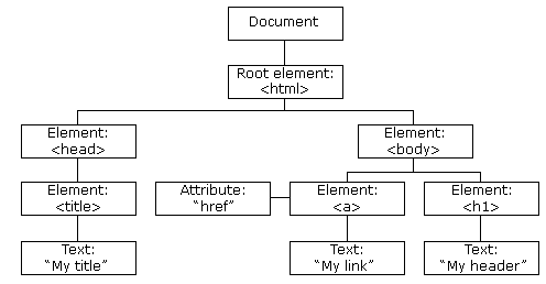
With the object model, JavaScript gets all the power it needs to create dynamic HTML:
- JavaScript can change all the HTML elements and attributes in the page and all the CSS styles in the page.
- JavaScript can react to all existing HTML events in the page
- JavaScript can create new HTML events in the page
The DOM is a W3C (World Wide Web Consortium) standard defined for accessing documents. The W3C DOM standard is separated into 3 different parts:
Core DOM - standard model for all document types
XML DOM - standard model for XML documents
HTML DOM - standard model for HTML documents
The HTML DOM defines:
- The HTML elements as objects
- The properties of all HTML elements
- The methods to access all HTML elements
- The events for all HTML elements
The innerHTML property can be used to get or change any HTML element, including < html> and < body>.
The document object represents your web page. If you want to access any element in an HTML page, you always start with accessing the document object. Below are some examples of how you can use the document object to access and manipulate HTML:
FIND
document.getElementById(id) Find an element by element id
document.getElementsByTagName(name) Find elements by tag name
document.getElementsByClassName(name) Find elements by class name
CHANGE
element.innerHTML = new html content Change the inner HTML of an element
element.attribute = new value Change the attribute value of an HTML element
element.style.property = new style Change the style of an HTML element
element.setAttribute(attribute, value) Change the attribute value of an HTML element
ADD
document.createElement(element) Create an HTML element
document.removeChild(element) Remove an HTML element
document.appendChild(element) Add an HTML element
document.replaceChild(new, old) Replace an HTML element
document.write(text) Write into the HTML output stream
document.getElementById(id).addEventListener(event,function,useCapture); // attaches an event handler to the specified element. The third parameter is a boolean value specifying whether to use event bubbling or event capturing. This parameter is optional.
EVENTS
document.getElementById(id).onclick = function(){code} Adding event handler code to an onclick event
document.getElementById(id).onload/onunload = function(){code} triggered when the user enters/leaves the page.
document.getElementById(id).onchange = function(){code} triggered when a user changes the content of an element.
document.getElementById(id).EVENT = function(){code} triggered when EVENT occurs.
HTML DOCUMENT COLLECTIONS
document.anchors Returns all <a> elements that have a name attribute 1
document.applets Deprecated 1
document.baseURI Returns the absolute base URI of the document 3
document.body Returns the <body> element 1
document.cookie Returns the document's cookie 1
document.doctype Returns the document's doctype 3
document.documentElement Returns the <html> element 3
document.documentMode Returns the mode used by the browser 3
document.documentURI Returns the URI of the document 3
document.domain Returns the domain name of the document server 1
document.domConfig Obsolete. 3
document.embeds Returns all <embed> elements 3
document.forms Returns all <form> elements 1
document.head Returns the <head> element 3
document.images Returns all <img> elements 1
document.implementation Returns the DOM implementation 3
document.inputEncoding Returns the document's encoding (character set) 3
document.lastModified Returns the date and time the document was updated 3
document.links Returns all <area> and <a> elements that have a href attribute 1
document.readyState Returns the (loading) status of the document 3
document.referrer Returns the URI of the referrer (the linking document) 1
document.scripts Returns all <script> elements 3
document.strictErrorChecking Returns if error checking is enforced 3
document.title Returns the <title> element 1
document.URL Returns the complete URL of the document 1
If you want to find all HTML elements that match a specified CSS selector (id, class names, types, attributes, values of attributes, etc), use the querySelectorAll() method:
const x = document.querySelectorAll("p.intro"); //returns a list of all <p> elements with class="intro".
e addEventListener() method allows you to add many events to the same element, without overwriting existing events.
There are two ways of event propagation in the HTML DOM, bubbling and capturing.
Event propagation is a way of defining the element order when an event occurs. If you have a < p> element inside a < div> element, and the user clicks on the < p> element, which element's "click" event should be handled first?
In bubbling the inner most element's event is handled first and then the outer: the < p> element's click event is handled first, then the < div> element's click event. In capturing the outer most element's event is handled first and then the inner: the < div> element's click event will be handled first, then the < p> element's click event.
The default value is false, which will use the bubbling propagation, when the value is set to true, the event uses the capturing propagation.
The removeEventListener() method removes event handlers that have been attached with the addEventListener() method:
element.removeEventListener("mousemove", myFunction);
The DOM can be navigated as tree implemented as arrays:
myTitle = document.getElementById("demo").childNodes[0].nodeValue;
The nodeName property specifies the name of a node. nodeName of an element node is the same as the tag name, nodeName of an attribute node is the attribute name, nodeName of a text node is always #text and nodeName of the document node is always #document
nodeName always contains the uppercase tag name of an HTML element.
The nodeValue property specifies the value of a node. nodeValue for element nodes is null nodeValue for text nodes is the text itself nodeValue for attribute nodes is the attribute value
BOM
There are no official standards for the Browser Object Model (BOM). Since modern browsers have implemented (almost) the same methods and properties for JavaScript interactivity, it is often referred to, as methods and properties of the BOM.
The window object is supported by all browsers. It represents the browser's window. All global JavaScript objects, functions, and variables automatically become members of the window object. Global variables are properties of the window object. Global functions are methods of the window object. Even the document object (of the HTML DOM) is a property of the window object:
window.document.getElementById("header");
is the same as:
document.getElementById("header");
Two properties can be used to determine the size of the browser window:
window.innerHeight - the inner height of the browser window (in pixels)
window.innerWidth - the inner width of the browser window (in pixels)
And there are methods for manipulating windows:
window.open() - open a new window
window.close() - close the current window
window.moveTo() - move the current window
window.resizeTo() - resize the current window
The window.screen object contains information about the user's screen. It can be written without the window prefix.
Properties:
- screen.width
- screen.height
- screen.availWidth
- screen.availHeight
- screen.colorDepth
- screen.pixelDepth
The window.location object can be used to get the current page address (URL) and to redirect the browser to a new page. It can be written without the window prefix. Some examples:
- window.location.href returns the href (URL) of the current page
- window.location.hostname returns the domain name of the web host
- window.location.pathname returns the path and filename of the current page
- window.location.protocol returns the web protocol used (http: or https:)
- window.location.assign() loads a new document
The window.history object contains the browsers history. To protect the privacy of the users, there are limitations to how JavaScript can access this object. Examples:
history.back() - same as clicking back in the browser
history.forward() - same as clicking forward in the browser
The window.navigator object contains information about the visitor's browser. Examples: navigator.appName navigator.appCodeName navigator.platform navigator.cookieEnabled navigator.userAgent
JavaScript has three kind of popup boxes: Alert box, Confirm box, and Prompt box. They can be written without the window prefix:
- alert("sometext");
- confirm("sometext");
- prompt("sometext","defaultText"); //often used if you want the user to input a value before entering a page.
The window object allows execution of code at specified time intervals. These time intervals are called timing events. The two key methods to use with JavaScript are:
setTimeout(function, milliseconds)
Executes a function, after waiting a specified number of milliseconds.
setInterval(function, milliseconds)
Same as setTimeout(), but repeats the execution of the function continuously.
window.clearTimeout(timeoutVariable)
stops the execution of the function specified in setTimeout().
window.clearInterval(timerVariable)
stops the executions of the function specified in the setInterval() method.
JavaScript can create, read, and delete cookies with the document.cookie property. With JavaScript, a cookie can be created like this: document.cookie = "username=John Doe"; Additional info can be added: document.cookie = "username=John Doe; expires=Thu, 18 Dec 2013 12:00:00 UTC; path=/"; By default, the cookie belongs to the current page and expires when the browser closes.
Read document cookies: let x = document.cookie;
document.cookie will return all cookies in one string much like: cookie1=value; cookie2=value; cookie3=value;
APIs
All browsers have a set of built-in Web APIs to support complex operations, and to help accessing data. For example, the Geolocation API can return the coordinates of where the browser is located: navigator.geolocation.getCurrentPosition(showPosition);
There are also infamous three party APIs from Twitter, Face*ook and You*ube
Constraint Validation DOM Methods
checkValidity() Returns true if an input element contains valid data. //Can be used to make a botton check if a form is valid.
setCustomValidity() Sets the validationMessage property of an input element.
The Web Storage API is a simple syntax for storing and retrieving data in the browser:
localStorage.setItem("name", "John Doe");
localStorage.getItem("name");
There is also the sessionStorage which stores data for only the session duration.
Web Workers makes possible to implement concurrency in the browser. It's as easy as:
if (typeof(w) == "undefined") {
w = new Worker("demo_workers.js");
}
And the page can react to events made by web workers:
w.onmessage = function(event){
document.getElementById("result").innerHTML = event.data;
};
A web worker can be massacred by the terminate() method.
Since web workers are in external files, they do not have access to the window object, document object nor the parent object that invoked them.
The Fetch API interface allows web browser to make HTTP requests to web servers:
async function getText(file) {
let myObject = await fetch(file);
let myText = await myObject.text();
myDisplay(myText);
}
AJAX
AJAX is a developer's dream, because you can:
Read data from a web server - after the page has loadedUpdate a web page without reloading the pageSend data to a web server - in the background
AJAX = Asynchronous JavaScript And XML.
AJAX is not a programming language, just uses a combination of:
- A browser built-in XMLHttpRequest object (to request data from a web server)
- JavaScript and HTML DOM (to display or use the data)
AJAX is a misleading name. AJAX applications might use XML to transport data, but it is equally common to transport data as plain text or JSON text.
AJAX allows web pages to be updated asynchronously by exchanging data with a web server behind the scenes. This means that it is possible to update parts of a web page, without reloading the whole page.
Very simple example:
<!DOCTYPE html>
<html>
<body>
<div id="demo">
<h2>Let AJAX change this text</h2>
<button type="button" onclick="loadDoc()">Change Content</button>
</div>
</body>
</html>
function loadDoc() {
const xhttp = new XMLHttpRequest();
xhttp.onload = function() {
document.getElementById("demo").innerHTML = this.responseText;
}
xhttp.open("GET", "ajax_info.txt", true);
xhttp.send();
}
Modern Browsers can use Fetch API instead of the XMLHttpRequest Object. The Fetch API interface allows web browser to make HTTP requests to web servers.If you use the XMLHttpRequest Object, Fetch can do the same in a simpler way.
XMLHttpRequest
The XMLHttpRequest object can be used to exchange data with a web server behind the scenes. Syntax for creating an XMLHttpRequest object:
xhttp = new XMLHttpRequest();
// Define a callback function
xhttp.onload = function() {
// Here you can use the Data
}
//To send a request to a server, you can use the open() and send() methods of the XMLHttpRequest object
xhttp.open("GET", "ajax_info.txt");
xhttp.send(); //It can be send(string) (For POST requests)
For security reasons, modern browsers do not allow access across domains. This means that both the web page and the XML file it tries to load, must be located on the same server.
XMLHttpRequest Object Properties
onload Defines a function to be called when the request is received (loaded)
onreadystatechange Defines a function to be called when the readyState property changes
readyState Holds the status of the XMLHttpRequest.
0: request not initialized
1: server connection established
2: request received
3: processing request
4: request finished and response is ready
responseText Returns the response data as a string
responseXML Returns the response data as XML data
status Returns the status-number of a request
200: "OK"
403: "Forbidden"
404: "Not Found"
statusText Returns the status-text (e.g. "OK" or "Not Found")
The onreadystatechange event is triggered four times (1-4), one time for each change in the readyState.
The file requested to open can be any kind of file even a servlet, script files or an image!
Server requests should be sent asynchronously. The async parameter of the open() method should be set to true (by default is TRUE, so it can be omitted):
xhttp.open("GET", "ajax_test.asp", true);
By sending asynchronously, the JavaScript does not have to wait for the server response, but can instead:
- execute other scripts while waiting for server response
- deal with the response after the response is ready
Synchronous XMLHttpRequest (async = false) is not recommended because the JavaScript will stop executing until the server response is ready. If the server is busy or slow, the application will hang or stop.
W3S JQuery Tutorial
Quick Reference
jQuery was created in 2006 by John Resig. It was designed to handle Browser Incompatibilities and to simplify HTML DOM Manipulation, Event Handling, Animations, and Ajax. However, after JavaScript Version 5 (2009), most of the jQuery utilities can be solved with a few lines of standard JavaScript.
Examples:
Finding HTML Element by Id
myElement = $("#id01"); //Jquery
myElement = document.getElementById("id01"); //JavaScript
Finding HTML Elements by Tag Name
myElements = $("p");
myElements = document.getElementsByTagName("p");
Finding HTML Elements by Class Name
myElements = $(".intro");
myElements = document.getElementsByClassName("intro");
Set Text Content (Set the inner text of an HTML element)
myElement.text("Hello Sweden!");
myElement.textContent = "Hello Sweden!";
Get Text Content
myText = $("#02").text();
myText = document.getElementById("02").textContent;
Set HTML Content
myElement.html("<p>Hello World</p>");
myElement.innerHTML = "<p>Hello World</p>";
Get HTML
content = myElement.html();
content = myElement.innerHTML;
Hiding HTML Elements
myElement.hide();
myElement.style.display = "none";
Showing HTML Elements
myElement.show();
myElement.style.display = "";
Styling HTML Elements
$("#demo").css("font-size","35px");
document.getElementById("demo").style.fontSize = "35px";
Remove an HTML element
$("#id02").remove();
document.getElementById("id02").remove();
Get Parent Element
myParent = $("#02").parent.prop("nodeName");
myParent = document.getElementById("02").parentNode.nodeName;
The jQuery library is a single JavaScript file, and you reference it with the HTML < script> tag:
<head>
<script src="jquery-3.5.1.min.js"></script>
</head>
If you don't have a problem you can query it from google's CDN:
<script src="https://ajax.googleapis.com/ajax/libs/jquery/3.5.1/jquery.min.js"></script>
Syntax
The jQuery syntax is tailor-made for selecting HTML elements and performing some action on the element(s).
Basic syntax is: $(selector).action()
- A $ sign to define/access jQuery
- A (selector) to "query (or find)" HTML elements
- A jQuery action() to be performed on the element(s)
There is a spacial function which is executed only when the document finishes to load:
$(document).ready(function(){
// jQuery methods go here...
});
It is good practice to wait for the document to be fully loaded and ready before working with it. This also allows you to have your JavaScript code before the body of your document, in the head section.
Selectors in JQuery have almost the same syntax and semantics of CSS:
$("p:first") Selects the first <p> element
$("[href]") Selects all elements with an href attribute
$("a[target!='_blank']") Selects all <a> elements with a target attribute value NOT equal to "_blank"
$("tr:odd") Selects all odd <tr> elements
Events
In jQuery, most DOM events have an equivalent jQuery method.
To assign a click event to all paragraphs on a page, you can do this:
$("p").click(function(){
// action goes here!!
});
Commonly Used jQuery Event Methods:
$(document).ready() allows us to execute a function when the document is fully loaded.
click() executed when the user clicks on the HTML element.
dblclick() executed when the user double clicks on the HTML element.
mouseenter() executed when the mouse pointer enters the HTML element:
mousedown() executed, when the left, middle or right mouse button is pressed down, while the mouse is over the HTML element.
hover(f1(),f2()) takes two functions and is a combination of the mouseenter() and mouseleave() methods. The first function is executed when the mouse enters the HTML element, and the second function is executed when the mouse leaves the HTML element.
The on() method attaches one or more event handlers for the selected elements:
$("p").on({
mouseenter: function(){
$(this).css("background-color", "lightgray");
},
mouseleave: function(){
$(this).css("background-color", "lightblue");
},
click: function(){
$(this).css("background-color", "yellow");
}
});
Effects
you can hide and show HTML elements with the hide() and show() methods:
$(selector).hide(speed,callback);
$(selector).show(speed,callback);
The optional speed parameter specifies the speed of the hiding/showing, and can take the following values: "slow", "fast", or milliseconds. The optional callback parameter is a function to be executed after the hide() or show() method completes.
An alternative method is called toggle(). Where shown elements are hidden and hidden elements are shown.
With jQuery you can fade an element in and out of visibility. jQuery has the following fade methods:
- fadeIn()
- fadeOut()
- fadeToggle()
- fadeTo()
It has an alternative cooler effect than hide and show.
The jQuery slideDown() method is used to slide down an element:
$(selector).slideDown(speed,callback);
You also have slide down and slide up.
The jQuery animate() method is used to create custom animations:
$(selector).animate({params},speed,callback);
The required params parameter defines the CSS properties to be animated. Example with relative values:
$("button").click(function(){
$("div").animate({
left: '250px',
height: '+=150px',
width: '+=150px'
});
});
By default, jQuery comes with queue functionality for animations. This means that if you write multiple animate() calls after each other, jQuery creates an "internal" queue with these method calls. Then it runs the animate calls ONE by ONE.
The jQuery stop() method is used to stop an animation or effect before it is finished:
$(selector).stop(stopAll,goToEnd); //stopAll parameter specifies whether also the animation queue should be cleared or not. Default is false.
With jQuery, you can chain together actions/methods. Chaining allows us to run multiple jQuery methods (on the same element) within a single statement:
$("#p1").css("color", "red").slideUp(2000).slideDown(2000);
DOM
Three simple, but useful, jQuery methods for DOM manipulation are:
text() - Sets or returns the text content of selected elements
html() - Sets or returns the content of selected elements (including HTML markup)
val() - Sets or returns the value of form fields
attr() - Used to set/change attribute values.
text(), html(), and val(), also come with a callback function. The callback function has two parameters: the index of the current element in the list of elements selected and the original (old) value. You then return the string you wish to use as the new value from the function:
$("#btn1").click(function(){
$("#test1").text(function(i, origText){
return "Old text: " + origText + " New text: Hello world!
(index: " + i + ")";
});
});
The attr() method also allows you to set multiple attributes at the same time. The following example demonstrates how to set both the href and title attributes at the same time:
$("button").click(function(){
$("#w3s").attr({
"href" : "https://www.w3schools.com/jquery/",
"title" : "W3Schools jQuery Tutorial"
});
});
Attr also comes with a callback function.
four jQuery methods that are used to add new content:
append() - Inserts content at the end of the selected elements
prepend() - Inserts content at the beginning of the selected elements
after() - Inserts content after the selected elements
before() - Inserts content before the selected elements
both the append() and prepend() methods can take an infinite number of new elements as parameters. The new elements can be generated with text/HTML (like we have done in the examples above), with jQuery, or with JavaScript code and DOM elements:
function appendText() {
var txt1 = "<p>Text.</p>"; // Create element with HTML
var txt2 = $("<p></p>").text("Text."); // Create with jQuery
var txt3 = document.createElement("p"); // Create with DOM
txt3.innerHTML = "Text.";
$("body").append(txt1, txt2, txt3); // Append the new elements
}
To remove elements and content, there are mainly two jQuery methods:
remove() - Removes the selected element (and its child elements)
empty() - Removes the child elements from the selected element
The jQuery remove() method also accepts one parameter, which allows you to filter the elements to be removed: $("p").remove(".test");
jQuery has several methods for CSS manipulation:
addClass() - Adds one or more classes to the selected elements
removeClass() - Removes one or more classes from the selected elements
toggleClass() - Toggles between adding/removing classes from the selected elements
css() - Sets or returns the style attribute
Examples: .blue { color: blue; } $("button").click(function(){ $("h1, h2, p").addClass("blue"); //adds class to selectors. }); $("button").click(function(){ $("h1, h2, p").removeClass("blue"); //removes calass from selectors });
The css() method sets or returns one or more style properties for the selected elements. Syntax:
css("propertyname");
Examples:
$("p").css("background-color"); // get property
$("p").css("background-color", "yellow"); // set property
$("p").css({"background-color": "yellow", "font-size": "200%"});
jQuery has several important methods for working with dimensions:
- width()
- height()
- innerWidth()
- innerHeight()
- outerWidth()
- outerHeight()
jQuery provides a variety of methods that allow us to traverse the DOM. The largest category of traversal methods are tree-traversal.
Three useful jQuery methods for traversing up the DOM tree are:
parent() //returns the direct parent element of the selected element.
parents() // returns all ancestor elements of the selected element, all the way up to the document's root element (<html>).
parentsUntil() //parentsUntil() method returns all ancestor elements between two given arguments.
Two useful jQuery methods for traversing down the DOM tree are:
children() //returns all direct children of the selected element.
find() // returns descendant elements of the selected element, all the way down to the last descendant.
Example:
$(document).ready(function(){
$("div").find("span");
});
There are many useful jQuery methods for traversing sideways in the DOM tree:
siblings() //returns all sibling elements of the selected element.
next() // returns the next sibling element of the selected element.
nextAll() // returns all next sibling elements of the selected element.
nextUntil() // the blow are analog to the above but backwards
prev()
prevAll()
prevUntil()
The most basic filtering methods are first(), last() and eq(), which allow you to select a specific element based on its position in a group of elements. Other filtering methods, like filter() and not() allow you to select elements that match, or do not match, a certain criteria.
The first() method returns the first element of the specified elements:
$(document).ready(function(){
$("div").first(); //selects the first div element
});
The eq() method returns an element with a specific index number of the selected elements:
$(document).ready(function(){
$("p").eq(1); //selects the second <p> element (index number 1)
});
The filter() method lets you specify a criteria. Elements that do not match the criteria are removed from the selection, and those that match will be returned:
$(document).ready(function(){
$("p").filter(".intro"); //returns all <p> elements with class name "intro"
});
AJAX
jQuery provides several methods for AJAX functionality. With the jQuery AJAX methods, you can request text, HTML, XML, or JSON from a remote server using both HTTP Get and HTTP Post - And you can load the external data directly into the selected HTML elements of your web page! Writing regular AJAX code can be a bit tricky, because different browsers have different syntax for AJAX implementation.
The jQuery load() method is a simple, but powerful AJAX method. The load() method loads data from a server and puts the returned data into the selected element:
$(selector).load(URL,data,callback);
The required URL parameter specifies the URL you wish to load. The optional data parameter specifies a set of querystring key/value pairs to send along with the request. The optional callback parameter is the name of a function to be executed after the load() method is completed. The callback function can have different parameters:
responseTxt - contains the resulting content if the call succeeds
statusTxt - contains the status of the call
xhr - contains the XMLHttpRequest object
Example:
$("button").click(function(){
$("#div1").load("demo_test.txt", function(responseTxt, statusTxt, xhr){
if(statusTxt == "success")
alert("External content loaded successfully!");
if(statusTxt == "error")
alert("Error: " + xhr.status + ": " + xhr.statusText);
});
});
The callback function can have different parameters:
responseTxt - contains the resulting content if the call succeeds statusTxt - contains the status of the call xhr - contains the XMLHttpRequest object
The jQuery get() and post() methods are used to request data from the server with an HTTP GET or POST request. he $.get() method requests data from the server with an HTTP GET request:
$.get(URL,callback);
The first parameter of $.get() is the URL we wish to request ("demo_test.asp"). The second parameter is a callback function. The first callback parameter holds the content of the page requested, and the second callback parameter holds the status of the request.
The $.post() method requests data from the server using an HTTP POST request:
$.post(URL,data,callback);
The required URL parameter specifies the URL you wish to request. The optional data parameter specifies some data to send along with the request. The optional callback parameter is the name of a function to be executed if the request succeeds.
Misc
The noConflict() method releases the hold on the $ shortcut identifier, so that other scripts can use it. You can of course still use jQuery, simply by writing the full name instead of the shortcut:
$.noConflict();
jQuery(document).ready(function(){
jQuery("button").click(function(){
jQuery("p").text("jQuery is still working!");
});
});
It is useful when there are other active frameworks using the dollar sign too.
Another neat thing you an do with jQuery is performing filter/search of specific items:
<script>
$(document).ready(function(){
$("#myInput").on("keyup", function() {
var value = $(this).val().toLowerCase();
$("#myTable tr").filter(function() {
($this).toggle($(this).text().toLowerCase().indexOf(value) > -1)
});
});
});
</script>
W3S BootStrap Tutorial
Bootstrap is a free front-end framework for faster and easier web development. Includes HTML and CSS based design templates for typography, forms, buttons, tables, navigation, modals, image carousels and many other, as well as optional JavaScript plugins. Bootstrap also gives you the ability to easily create responsive designs.
To use bootstrap you can download it or use a CDN:
<!-- Latest compiled and minified CSS -->
<link rel="stylesheet" href="https://maxcdn.bootstrapcdn.com/bootstrap/4.5.2/css/bootstrap.min.css">
<!-- jQuery library -->
<script src="https://ajax.googleapis.com/ajax/libs/jquery/3.5.1/jquery.min.js"></script>
<!-- Popper JS -->
<script src="https://cdnjs.cloudflare.com/ajax/libs/popper.js/1.16.0/umd/popper.min.js"></script>
<!-- Latest compiled JavaScript -->
<script src="https://maxcdn.bootstrapcdn.com/bootstrap/4.5.2/js/bootstrap.min.js"></script>
For responsiveness to work a meta tag must be added:
<meta name="viewport" content="width=device-width, initial-scale=1">
Bootstrap 4 also requires a containing element to wrap site contents. There are two container classes to choose from:
- The .container class provides a responsive fixed width container
- The .container-fluid class provides a full width container, spanning the entire width of the viewport
Grid System
Bootstrap's grid system is built with flexbox and allows up to 12 columns across the page. The grid system is responsive, and the columns will re-arrange automatically depending on the screen size. Make sure that the sum adds up to 12 or fewer (it is not required that you use all 12 available columns).
The Bootstrap 4 grid system has five classes:
.col- (extra small devices - screen width less than 576px)
.col-sm- (small devices - screen width equal to or greater than 576px)
.col-md- (medium devices - screen width equal to or greater than 768px)
.col-lg- (large devices - screen width equal to or greater than 992px)
.col-xl- (xLarge devices - screen width equal to or greater than 1200px)
Each class scales up, so if you wish to set the same widths for sm and md, you only need to specify sm.
Example:
<div class="row">
<div class="col-sm-3">.col-sm-3</div>
<div class="col-sm-3">.col-sm-3</div>
<div class="col-sm-3">.col-sm-3</div>
<div class="col-sm-3">.col-sm-3</div>
</div>
Some Bootstrap 4 grid system rules:
Rows must be placed within a .container (fixed-width) or .container-fluid (full-width) for proper alignment and padding
Use rows to create horizontal groups of columns
Content should be placed within columns, and only columns may be immediate children of rows
Predefined classes like .row and .col-sm-4 are available for quickly making grid layouts
Columns create gutters (gaps between column content) via padding. That padding is offset in rows for the first and last column via negative margin on .rows
Grid columns are created by specifying the number of 12 available columns you wish to span. For example, three equal columns would use three .col-sm-4
Column widths are in percentage, so they are always fluid and sized relative to their parent element
The biggest difference between Bootstrap 3 and Bootstrap 4 is that Bootstrap 4 now uses flexbox, instead of floats. One big advantage with flexbox is that grid columns without a specified width will automatically layout as "equal width columns" (and equal height). Example: Three elements with .col-sm will each automatically be 33.33% wide from the small breakpoint and up.
Grid behaviour can be specified in different devices by choosing the different column classes (sm/md/lg/xk) available.
Typography
Bootstrap 4 uses a default font-size of 16px, and its line-height is 1.5.The default font-family is "Helvética Neue", Helvética, Arial, sans-serif. In addition, all
elements have margin-top: 0 and margin-bottom: 1rem (16px by default).
Display headings are used to stand out more than normal headings (larger font-size and lighter font-weight), and there are four classes to choose from: .display-1, .display-2, .display-3, .display-4
All HTML are styled in a "cool" way. Example of tags: < dl>, < mark>, < code>, < kbd>, < small>, etc.
Colours
Bootstrap 4 has some contextual classes that can be used to provide "meaning through colors". The classes for text colors are: .text-muted, .text-primary, .text-success, .text-info, .text-warning, .text-danger, .text-secondary, .text-white, .text-dark, .text-body (default body color/often black) and .text-light
The classes for background colors are: .bg-primary, .bg-success, .bg-info, .bg-warning, .bg-danger, .bg-secondary, .bg-dark and .bg-light.
HTML Elements
The .table class adds basic styling to a table. There are also additional classes such as table-responsive, table-small, table-dark, etc.
Images classes can be .img-fluid, .img-thumbnail, .rounded-circle, etc.
Jumbotron
A jumbotron indicates a big grey box for calling extra attention to some special content or information.
Tip: Inside a jumbotron you can put nearly any valid HTML, including other Bootstrap elements/classes.
Example:
<div class="jumbotron">
<h1>Bootstrap Tutorial</h1>
<p>Bootstrap is the most popular HTML, CSS...</p>
</div>
Alerts
Bootstrap 4 provides an easy way to create predefined alert messages: Alerts are created with the .alert class, followed by one of the contextual classes .alert-success, .alert-info, .alert-warning, .alert-danger, .alert-primary, .alert-secondary, .alert-light or .alert-dark.
Example:
<div class="alert alert-success">
<strong>Success!</strong> Indicates a successful or positive action.
</div>
Alerts can be really fancy:
<div class="alert alert-danger alert-dismissible fade show">
Button
Bootstrap 4 provides different styles of buttons:
<button type="button" class="btn">Basic</button>
<button type="button" class="btn btn-primary">Primary</button>
<button type="button" class="btn btn-secondary">Secondary</button>
<button type="button" class="btn btn-success">Success</button>
<button type="button" class="btn btn-info">Info</button>
<button type="button" class="btn btn-warning">Warning</button>
<button type="button" class="btn btn-danger">Danger</button>
<button type="button" class="btn btn-dark">Dark</button>
<button type="button" class="btn btn-light">Light</button>
<button type="button" class="btn btn-link">Link</button>
You can add btn btn-outline for outline buttons. And change the size of them with different classes.
Spinner button!
<button class="btn btn-primary" disabled>
<span class="spinner-border spinner-border-sm"></span>
Loading..
</button>
BS4 allows you to group a series of buttons together (on a single line) in a button group:
<div class="btn-group">
<button type="button" class="btn btn-primary">Apple</button>
<button type="button" class="btn btn-primary">Samsung</button>
<button type="button" class="btn btn-primary">Sony</button>
</div>
Badges
Badges are used to add additional information to any content. Use the .badge class together with a contextual class (like .badge-secondary) within elements to create rectangular badges. Note that badges scale to match the size of the parent element (if any):
<span class="badge badge-primary">Primary</span>
<span class="badge badge-secondary">Secondary</span>
<span class="badge badge-success">Success</span>
<span class="badge badge-danger">Danger</span>
<span class="badge badge-warning">Warning</span>
<span class="badge badge-info">Info</span>
<span class="badge badge-light">Light</span>
<span class="badge badge-dark">Dark</span>
Progress bars
To create a default progress bar, add a .progress class to a container element and add the .progress-bar class to its child element. Use the CSS width property to set the width of the progress bar:
<div class="progress">
<div class="progress-bar" style="width:70%"></div>
</div>
Animated progress bar:
<div class="progress-bar progress-bar-striped progress-bar-animated" style="width:40%"></div>
Spinners
To create a spinner/loader, use the .spinner-border class:
<div class="spinner-border"></div>
There are 213421 different spinners.
Lists
Pagination
If you have a web site with lots of pages, you may wish to add some sort of pagination to each page. To create a basic pagination, add the .pagination class to an < ul> element. Then add the .page-item to each < li> element and a .page-link class to each link inside < li>:
<ul class="pagination">
<li class="page-item"><a class="page-link" href="#">Previous</a></li>
<li class="page-item"><a class="page-link" href="#">1</a></li>
<li class="page-item"><a class="page-link" href="#">2</a></li>
<li class="page-item"><a class="page-link" href="#">3</a></li>
<li class="page-item"><a class="page-link" href="#">Next</a></li>
</ul>
List Groups
To create a basic list group, use an < ul> element with class .list-group, and < li> elements with class .list-group-item:
<ul class="list-group">
<li class="list-group-item">First item</li>
<li class="list-group-item">Second item</li>
<li class="list-group-item">Third item</li>
</ul>
Cards
A card in Bootstrap 4 is a bordered box with some padding around its content. It includes options for headers, footers, content, colors, etc. A basic card is created with the .card class, and content inside the card has a .card-body class:
<div class="card">
<div class="card-header">Header</div>
<div class="card-body">Content</div>
<div class="card-footer">Footer</div>
</div>
Dropdown menu
A dropdown menu is a toggleable menu that allows the user to choose one value from a predefined list:
<div class="dropdown">
<button type="button" class="btn btn-primary dropdown-toggle" data-toggle="dropdown">
Dropdown button
</button>
<div class="dropdown-menu">
<div class="dropdown-header">Dropdown header 1</div>
<a class="dropdown-item" href="#">Link 1</a>
<a class="dropdown-item" href="#">Link 2</a>
<div class="dropdown-divider"></div>
<a class="dropdown-item" href="#">Link 3</a>
</div>
</div>
Collapse
The .collapse class indicates a collapsible element (a < div> in our example); this is the content that will be shown or hidden with a click of a button:
<a href="#demo" data-toggle="collapse">Collapsible</a>
<div id="demo" class="collapse">
Lorem ipsum dolor text....
</div>
Navs
If you want to create a simple horizontal menu, add the .nav class to a < ul> element, followed by .nav-item for each < li> and add the .nav-link class to their links:
<ul class="nav">
<li class="nav-item">
<a class="nav-link" href="#">Link</a>
</li>
<li class="nav-item">
<a class="nav-link" href="#">Link</a>
</li>
<li class="nav-item">
<a class="nav-link" href="#">Link</a>
</li>
<li class="nav-item">
<a class="nav-link disabled" href="#">Disabled</a>
</li>
</ul>
Tabs
Turn the nav menu into navigation tabs with the .nav-tabs class. Add the .active class to the active/current link. To make the tabs toggleable, add the data-toggle="tab" attribute to each link. Then add a .tab-pane class with a unique ID for every tab and wrap them inside a < div> element with class .tab-content.
If you want the tabs to fade in and out when clicking on them, add the .fade class to .tab-pane:
<!-- Nav tabs -->
<ul class="nav nav-tabs">
<li class="nav-item">
<a class="nav-link active" data-toggle="tab" href="#home">Home</a>
</li>
<li class="nav-item">
<a class="nav-link" data-toggle="tab" href="#menu1">Menu 1</a>
</li>
<li class="nav-item">
<a class="nav-link" data-toggle="tab" href="#menu2">Menu 2</a>
</li>
</ul>
<!-- Tab panes -->
<div class="tab-content">
<div class="tab-pane container active" id="home">...</div>
<div class="tab-pane container fade" id="menu1">...</div>
<div class="tab-pane container fade" id="menu2">...</div>
</div>
NavBar
A navigation bar is a navigation header that is placed at the top of the page, a navigation bar can extend or collapse, depending on the screen size.
A standard navigation bar is created with the .navbar class, followed by a responsive collapsing class: .navbar-expand-xl|lg|md|sm (stacks the navbar vertically on extra large, large, medium or small screens). To add links inside the navbar, use a < ul> element with class="navbar-nav". Then add < li> elements with a .nav-item class followed by an < a> element with a .nav-link class.
Use the .sticky-top class to make the navbar fixed/stay at the top of the page when you scroll past it:
<nav class="navbar navbar-expand-sm bg-dark navbar-dark sticky-top">
<!-- Links -->
<ul class="navbar-nav">
<li class="nav-item">
<a class="nav-link" href="#">Link 1</a>
</li>
<li class="nav-item">
<a class="nav-link" href="#">Link 2</a>
</li>
<li class="nav-item">
<a class="nav-link" href="#">Link 3</a>
</li>
</ul>
</nav>
Forms
Form controls automatically receive some global styling with Bootstrap:
All textual < input>, < textarea>, and < select> elements with class .form-control have a width of 100%. Bootstrap provides two types of form layouts:
- Stacked (full-width) form
- Inline form
Forms can be arranged with grids:
<form>
<div class="form-row">
<div class="col">
<input type="text" class="form-control" id="email" placeholder="Enter email" name="email">
</div>
<div class="col">
<input type="password" class="form-control" placeholder="Enter password" name="pswd">
</div>
</div>
</form>
You can use different validation classes to provide valuable feedback to users. Add either .was-validated or .needs-validation to the < form> element, depending on whether you want to provide validation feedback before or after submitting the form. The input fields will have a green (valid) or red (invalid) border to indicate what's missing in the form. You can also add a .valid-feedback or .invalid-feedback message to tell the user explicitly what's missing, or needs to be done before submitting the form.
n this example, we use .needs-validation, which will add the validation effect AFTER the form has been submitting (if there's anything missing). Note that you will also have to add some jQuery code for this example to work properly:
<form action="/action_page.php" class="needs-validation" novalidate>
<div class="form-group">
<label for="uname">Username:</label>
<input type="text" class="form-control" id="uname" placeholder="Enter username" name="uname" required>
<div class="valid-feedback">Valid.</div>
<div class="invalid-feedback">Please fill out this field.</div>
</div>
<div class="form-group">
<label for="pwd">Password:</label>
<input type="password" class="form-control" id="pwd" placeholder="Enter password" name="pswd" required>
<div class="valid-feedback">Valid.</div>
<div class="invalid-feedback">Please fill out this field.</div>
</div>
<div class="form-group form-check">
<label class="form-check-label">
<input class="form-check-input" type="checkbox" name="remember" required> I agree on blabla.
<div class="valid-feedback">Valid.</div>
<div class="invalid-feedback">Check this checkbox to continue.</div>
</label>
</div>
<button type="submit" class="btn btn-primary">Submit</button>
</form>
<script>
// Disable form submissions if there are invalid fields
(function() {
'use strict';
window.addEventListener('load', function() {
// Get the forms we want to add validation styles to
var forms = document.getElementsByClassName('needs-validation');
// Loop over them and prevent submission
var validation = Array.prototype.filter.call(forms, function(form) {
form.addEventListener('submit', function(event) {
if (form.checkValidity() === false) {
event.preventDefault();
event.stopPropagation();
}
form.classList.add('was-validated');
}, false);
});
}, false);
})();
</script>
Input Groups
The .input-group class is a container to enhance an input by adding an icon, text or a button in front or behind the input field as a "help text". Use .input-group-prepend to add the help text in front of the input, and .input-group-append to add it behind the input. At last, add the .input-group-text class to style the specified help text.
<div class="input-group mb-3">
<div class="input-group-prepend">
<span class="input-group-text">@</span>
</div>
<input type="text" class="form-control" placeholder="Username">
</div>
You can add buttons, labels and much more in input groups!
Bootstrap 4 comes with customized form elements, that are meant to replace browser defaults. This classes start with custom-, they include animations and other fancy stuff.
Carousel
The Carousel is a slideshow for cycling through elements. The following example shows how to create a basic carousel with indicators and controls:
<div id="demo" class="carousel slide" data-ride="carousel"> //slide adds a CSS transition and animation effect when sliding from one item to the next.
<!-- Indicators -->
<ul class="carousel-indicators"> //Adds indicators for the carousel. These are the little dots at the bottom of each slide
<li data-target="#demo" data-slide-to="0" class="active"></li>
<li data-target="#demo" data-slide-to="1"></li>
<li data-target="#demo" data-slide-to="2"></li>
</ul>
<!-- The slideshow -->
<div class="carousel-inner"> //Adds slides to the carousel
<div class="carousel-item active"> //Specifies the content of each slide
<img src="la.jpg" alt="Los Angeles">
</div>
<div class="carousel-item">
<img src="chicago.jpg" alt="Chicago">
</div>
<div class="carousel-item">
<img src="ny.jpg" alt="New York">
</div>
</div>
<!-- Left and right controls -->
<a class="carousel-control-prev" href="#demo" data-slide="prev"> //Used together with .carousel-control-prev to create a "previous" button
<span class="carousel-control-prev-icon"></span>
</a>
<a class="carousel-control-next" href="#demo" data-slide="next">
<span class="carousel-control-next-icon"></span>
</a>
</div>
Modals
The Modal component is a dialog box/popup window that is displayed on top of the current page. Example:
<!-- Button to Open the Modal -->
<button type="button" class="btn btn-primary" data-toggle="modal" data-target="#myModal">
Open modal
</button>
<!-- The Modal -->
<div class="modal" id="myModal"> //fade class an be added to add cool effects.
<div class="modal-dialog">
<div class="modal-content">
<!-- Modal Header -->
<div class="modal-header">
<h4 class="modal-title">Modal Heading</h4>
<button type="button" class="close" data-dismiss="modal">×</button>
</div>
<!-- Modal body -->
<div class="modal-body">
Modal body..
</div>
<!-- Modal footer -->
<div class="modal-footer">
<button type="button" class="btn btn-danger" data-dismiss="modal">Close</button>
</div>
</div>
</div>
</div>
Tooltips & Popover
To create a tooltip, add the data-toggle="tooltip" attribute to an element. Use the title attribute to specify the text that should be displayed inside the tooltip:
<a href="#" data-toggle="tooltip" title="Hooray!">Hover over me</a>
The Popover component is similar to tooltips; it is a pop-up box that appears when the user clicks on an element. The difference is that the popover can contain much more content. Example:
<a href="#" data-toggle="popover" title="Popover Header" data-content="Some content inside the popover">Toggle popover</a>
Note: Tooltips and popovers must be initialized with jQuery: select the specified element and call the tooltip() adn popover() method.
The following code will enable all tooltips and popovers in the document:
<script>
$(document).ready(function(){
$('[data-toggle="tooltip"]').tooltip();
});
</script>
<script>
$(document).ready(function(){
$('[data-toggle="popover"]').popover();
});
</script>
Toast
The toast component is like an alert box that is only shown for a couple of seconds when something happens (i.e. when the user clicks on a button, submits a form, etc.). To create a toast, use the .toast class, and add a .toast-header and a .toast-body inside of it:
<div class="toast">
<div class="toast-header">
Toast Header
</div>
<div class="toast-body">
Some text inside the toast body
</div>
</div>
All this kinds of dynamic content must be first initialized with JQuery. Toasts are hidden by default. Use the data-autohide="false" attribute to show it by default. To close it, use a < button> element and add data-dismiss="toast".
Scrollspy
Scrollspy is used to automatically update links in a navigation list based on scroll position. Example:
<!-- The scrollable area -->
<body data-spy="scroll" data-target=".navbar" data-offset="50">
<!-- The navbar - The <a> elements are used to jump to a section in the scrollable area -->
<nav class="navbar navbar-expand-sm bg-dark navbar-dark fixed-top">
...
<ul class="navbar-nav">
<li><a href="#section1">Section 1</a></li>
...
</nav>
<!-- Section 1 -->
<div id="section1">
<h1>Section 1</h1>
<p>Try to scroll this page and look at the navigation bar while scrolling!</p>
</div>
...
</body>
Utilities
Bootstrap 4 has a lot of utility/helper classes to quickly style elements without using any CSS code.
- border classes can be used to instantiate borders. Add rounded corners to an element with the rounded class.
- Float an element to the right with the .float-right class or to the left with .float-left, and clear floats with the .clearfix class.
- Set the height of an element with the h-* classes (.h-25, .h-50, .h-75, .h-100, .mh-100).
- Use the shadow- classes to add shadows to an element.
- Add the .embed-responsive-item to any embed elements (like < iframe> or < video>) in a parent element with .embed-responsive and an aspect ratio of your choice.
- Use the .visible or .invisible classes to control the visibility of elements.
- Use the .fixed-top class to make any element fixed/stay at the top of the page.
- Use the .sticky-top class to make any element fixed/stay at the top of the page when you scroll past it.
- Use the .close class to style a close icon.
- And many more!
Flexbox
Use flex classes to control the layout of Bootstrap 4 components.
The biggest difference between Bootstrap 3 and Bootstrap 4 is that Bootstrap 4 now uses flexbox, instead of floats, to handle the layout. The Flexible Box Layout Module, makes it easier to design flexible responsive layout structure without using float or positioning.
Example:
<div class="d-flex p-3 bg-secondary text-white">
<div class="p-2 bg-info">Flex item 1</div>
<div class="p-2 bg-warning">Flex item 2</div>
<div class="p-2 bg-primary">Flex item 3</div>
</div>
Examples:
FLEX CONTAINER
.d-*-flex Creates a flexbox container for different screens
.d-*-inline-flex Creates an inline flexbox container for different screens
DIRECTION
.flex-*-row Display flex items horizontally on different screens
.flex-*-row-reverse Display flex items horizontally, and right-aligned, on different screens
.flex-*-column Display flex items vertically on different screens
.flex-*-column-reverse Display flex items vertically, with reversed order, on different screens screens
Media Objects
Bootstrap provides an easy way to align media objects (like images or videos) together with content. Media objects are often used to display blog comments, tweets and so on. To create a media object, add the .media class to a container element, and place media content inside a child container with the .media-body class. Add padding and margins as needed, with the spacing utilities:
<div class="media border p-3">
<img src="img_avatar3.png" alt="John Doe" class="mr-3 mt-3 rounded-circle" style="width:60px;">
<div class="media-body">
<h4>John Doe <small><i>Posted on February 19, 2016</i></small></h4>
<p>Lorem ipsum...</p>
</div>
</div>
Media objects can also be nested (example: comment reply of a previous post):
<div class="media border p-3">
<img src="img_avatar3.png" alt="John Doe" class="mr-3 mt-3 rounded-circle" style="width:60px;">
<div class="media-body">
<h4>John Doe <small><i>Posted on February 19, 2016</i></small></h4>
<p>Lorem ipsum...</p>
<div class="media p-3">
<img src="img_avatar2.png" alt="Jane Doe" class="mr-3 mt-3 rounded-circle" style="width:45px;">
<div class="media-body">
<h4>Jane Doe <small><i>Posted on February 20 2016</i></small></h4>
<p>Lorem ipsum...</p>
</div>
</div>
</div>
</div>
Web Services
Los web services van a ser la herramienta que va a realizar la comunicación entre el servidor web y el servidor central vía web services. Ya no va a ser una librería .jar ahí barata sino literalmente un servidor central :DD.
Los web services permiten comunicar sistemas ubicados en distintos hosts a través de internet e incluso desarrollados en tecnologías distintas. Todo esto se basa en el concepto de sistemas distribuidos: procesamiento de la información que está distribuido entre dos o más computadores en la red.
Existe un nuevo grado de complejidad (llevar a cabo la comunicación entre componentes): middleware, escalabilidad, apertura, tolerancia a fallas, concurrencia, etc. Los grandes sistemas de gran escala hoy en día son sistemas distribuidos.
¡¡¡En cuanto a la tarea, es hora de desacoplar todo!!! Va a haber comunicación entre la estación de trabajo y el servidor web a través del servidor central que recibe ambas comunicaciones. Para eso vamos a utilizar herramientas de middleware.
Middleware:
Es el software que permite gestionar partes de un sistema distribuido asegurando que pueden comunicarse e intercambiar datos. Permite las interacciones a nivel de aplicación entre distintos componentes. (Ej: entre un servidor y una base de datos). Sin middleware se requeriría programar módulos de comunicación de bajo nivel cada vez que se quiere hacer un cambio.
Tipos de middleware:
- Sockets, ODBC/JDBC (Bases de datos)
- Message Oriented Middleware (MOM)
- Mensajería (RabbitMQ)
- AMQP (Advanced Message Queueing Protocol)
- Remote procedure calls (RPC,RMI,COBRA,DCOM) (permite invocar procedimientos remotos como si fuesen locales)
- Web Services (SOAP y REST)
- SOAP (Simple Object Access Protocol): Comunicación sobre HTTP
- REST (Representational state transfere): Ver entidades como recursos sobre la red.
La idea de los web services es implementar comunicación entre sistemas con distintas tecnologías.
Web Services
Es una tecnología que me permite comunicar sistemas en distinta tecnología y habilitar comunicación vía internet más fácilmente. Permiten una manera estándar de interpretar mensajes entre diferentes aplicaciones de software ejecutando en distintas plataformas.
SOAP
Orientada a operaciones. Utiliza XML y se comunica a traves de HTTP. Existen librerías ya existentes que permiten manejar la comunicación entre los clientes y servidor. Existen 3 elementos que definen la comunicación de servicios web SOAP:
- XML Schema Definition (XSD) para definir los tipos de mensajes
- WS Definition Language (WSDL) para especificar los WS
- Simple Object Access Protocol (SOAP) para llevar adelante la comunicación
WSDL Define los servicios que va a tener el webservice. XML Schema define la estructura de un documento XML (tipos, atributos, relaciones válidas) Por lo tanto, un XML valido será aquel que obedece un XML schema. WSDL: Este es mi servicio web, estas son las operaciones disponibles, estos son los mensajes de entrada y estos son los de salida.
¡¡¡La definición de todos los XML y eso lo va a hacer todo automático una librería!!! ¡Que fantástico Eclipse EE! El proveedor es el que publica el WSDL que define al WS.
Existen servidores web ligeros (Lightweight web server) que provee java para facilitar la publicación de los webs services sin la necesidad de hostear un tomcat. Permite el deployment rápido.
El mensaje en si también es un XML.
Para los usuarios estamos construyendo un sistema integrado, para nosotros es un sistema distribuido.
El servidor tiene que publicar sus operaciones en un lugar alcanzable y el cliente tiene que saber ese lugar para poder alcanzar el webservice.
REST
Está de moda porque no manejan el overhead de SOAP. Se manejan sobre XML, JSON, etc.
Implementación
Vamos a tener dos estructuras (una en el servidor: Server Stub y otra en el cliente: Proxy) que nos van a permitir abstraer la comunicación entre los dos componentes. Estos son los que van a empaquetar y desempaquetar los xml para pasarlos a objetos y viceversa. Haciendo la comunicación lo más seamless posible.
El server Stub es quien hace posible la publicación y representa la lógica del servicio. El Proxy le brinda al cliente facilidades para acceder a un servicio. Encapsula la implementación asociada a dicho consumo, construyendo objetos java obtenidos del mensaje de respuesta del servidor.
Se utiliza la anotación @webmethod.
Me puedo asegurar que el publicador está funcionando consultando desde el navegador el servicio (¡utiliza HTTP SOAP!) y este tendría que devolver un XML con el contenido del objeto solicitado: localhost:6666/publicador?wsdl.
Hay un tal SOAP_UI que permite también testear al servidor web.
Para la aplicación del cliente, existen dos formas de generar el Proxy.
- Usando el IDE (Nuevo WS, get URL ,listo...)
- Usando el wsimport (Abrimos consola, -keep url, listo...)
Ambos métodos generan al nivel interno el código que permite al cliente hacer uso del servicio y creo una serie de objetos que son los que se utilizan de forma local. En ambos casos es imprescindible indicar la URL de donde se encuentran los métodos.
Pasos para crear un web service
- Definir que componente es el servidor
- Definir que componente es el cliente
- Para el servidor:
- Anotar la clase o interfaz que correrá en el servidor
- Definir la dirección en que se publica el servicio
- Publicar y generar Stubs del servidor (WSDL y WS)
- Para el cliente:
- Escribir un cliente que usa el servidor (ej. Servlet)
- Generar los proxies necesarios desde el WSDL del WS
Vamos a utilizar anotaciones para la generación de WS y tipos válidos. Ejemplos:
@WebService: A nivel de clase, indica que la misma debe ser expuesta como WS
@WebMethod: A nivel de método, indica que el método será incluido en la interfaz del servicio
@WebParam: A nivel de parámetro, indica que el nombre y tipo que tomará dicho parámetro en el servicio
@SOAPBindiing: Indica el estilo de codificación SOAP que utilizará el servicio (RPC)
@XMLAccessorType: Determina el control sobre la serialización por defecto de las propiedades
Los tipos de datos válidos para el WS son:
- Tipos de datos nativos de java
- Los datatypes deben ser un Java Bean (una clase que cumple ciertas convenciones: serializable, constructor vacío, getters y setters, etc.)
- Las excepciones se mapean con SOAP Faults
- Hay cosas que están obsoletos en SOAP como los datatypes vector y date.
Persistencia
Persistencia de objetos consiste en extender el tiempo de vida de un objeto más allá del tiempo de vida del proceso que lo creó.
El destino de la persistencia puede ser una fuente de datos (Data Source) donde se persiste la información de una aplicación. O una BD Relacional, archivos XML, binarios, etc.
Mecanismo de persistencia: Técnica básica que permite resolver la persistencia de objetos. Ejemplos son: acceso directo a una DB, mappeador objeto<->relacional, serialization de objetos, generador de código, etc.
Para acceder directo a la BD tiene la ventaja de que hay un buen desempeño debido a que el acceso a la memoria es directo, la ventaja es la complejidad de diseñar la persistencia. Una herramienta para esto es la Java Database Connectivity (JDBC).
JDBC
Provee una arquitectura basada en drivers e interfaces estándar. Se basa en sentencia SQL para realizar consultas y para modificar la instancia de la BD. La interfaz de programación es portable pero el lenguaje SQL depende del DBMS.
DAO
Database access object. Es un patrón de diseño que encapsula todo el acceso a una fuente de datos utilizando la capa de acceso a datos. Cada objeto de negocio a ser persistido crea una DAO con la info necesaria, luego utiliza el objeto DAO para obtener y guardar información del origen de datos.
Aquí es donde se puede dar el impedance mismatch. Donde el mappeo de la información del objeto no se puede traducir directamente a una base de datos relacional:
Clases objetos <-> Tablas, Filas
Atributos, propiedades <-> Columnas
Identidad <-> Primary key
Relaciones/ referencias a otra entidad <-> Foreign Key
Herencia, polimorfismo <-> NO SOPORTADO
metodos <-> lógica SQL, store procedures, triggers
código portable <-> depende del DBMS
Mappeador objeto relacional
A través de metadata que le pasamos le explicamos como hacer el mapping entre los objetos y la base de datos. Esto reduce la cantidad de código necesario para realizar la persistencia. (ventaja). Como desventaja ahora hay que mantener metadata sobre las entidades. Las herramientas JAVA para el mappeador son las JPA, la cuales están implementadas en Hibernate y EclipseLink
JAVA Persistence API
Es un framework liviano para mapear objetos a BD relacionales usando la plataforma Java en sus ediciones SE y enterprise (Java EE)
Surge originalmente de la mano de EJB3.0 adoptando la experiencia de años de uso de Hibernate y Toplink. Es decir, vamos a trabajar con la API de JPA
La persistence está basada en POJOs (¡Plain Old Java Objects (¡Los objetos clásicos de toda la vida!)) La persistencia esta guiada por metadata en XML, anotaciones, configuración por excepción, etc.
Para realizar consultas hay mecanismo para realizar consultas, recorrer objetos y acceder a sus propiedades.
Implementación
Las entidades se anotan con @Entity, tienen una propiedad anotada con @id, un zero argument constructor public/protected, no es final, puede extender a otra y ser abstracta. Y importante: Es un POJO. Si cumple esto podemos decir que es una entidad y va a ser posible mappear utilizando JPA.
Por default cada entidad tiene su tabla, esto se puede modificar con @Table(name="emp") para guardar las entidades en tablas ya definidas.
Las id también podrían generarse automáticamente. Utilizando implementaciones del propio JPA (Se define con anotaciones)
Por defecto se persisten todos los atributos en columnas por defecto en el mismo nombre, si se quiere cambiar esto se puede hacer @(Col="X ") También hay anotaciones y cosas así: @ManyToOne, @JoinColumn(name="PSPACE_ID"), @OneToOne(mappedBy="parkingSpace"),@ManyToMany
Es posible configurar absolutamente todo. Es posible configurar la tabla usada para mantener las relaciones a través de la anotación @JoinTable(name="", joinColumns=@JoinColumn(name='"), inverseJoinColumnas=@JoinColumn(name=""))
Entity Manager
Las entidades no se persisten a sí mismas cuando son creadas, así como tampoco son removidas cuando el garbage collector recicla los objetos. Es la lógica de la aplicación la que debe manejar el ciclo de vida de persistencia. Para ello, JPA provee la interface Entity Manager. La EntityManagerFactory se obtiene de la clase Persistence:
EntityManagerFactory e = Persistence.createEntityManagerFactory("X");
EntityManager em = e.createEntityManager()
Esta interfaz define una serie de métodos que permiten manejar las entidades. Por ejemplo: persistencia de entidades, recuperación de entidades , obtención de consultas, inicio y fin de transacciones.